Narrating Forms
Encounters at the Met on Sunday, September 27, 2026
How does an image generate meaning before a single word of text is read? This semester, students of the School of Visual Arts enter the European Painting Galleries at The Metropolitan Museum of Art for Narrating Forms, a project built on one premise: that the formal elements upon a surface are a painting's primary narrator. Moving past the habit of viewing historical paintings as passive illustrations of text, our inquiry treats visual form as an active language through which a painting shapes its own discourse: the intrinsic properties of a line, the illusion of light, the recession beyond the picture surface.
Our analytical foundation is anchored in Jonathan Blower's recent translation of Heinrich Wölfflin's Principles of Art History, published by the Getty Research Institute. In her introductory essay to this critical edition, Evonne Levy reminds us of the book's complex survival, noting that despite decades of methodological shifts, Wölfflin's text remains a permanent baseline because it "engendered debates... in the twentieth century for a renewed reading of the text in the twenty-first." Guided by these comparative categories and Laurie Schneider Adams' A History of Western Art, each student composed a written encounter with a single painting, bridging historical context with an active awareness of the phenomenology of vision: that a painter, knowingly or not, negotiates between what is inscribed upon the retina, with its own perspective, and the reality outside the body, where perspective, whether Albertian or Keplerian, does not exist.
The essays gathered here span more than five centuries. The Tuesday group ranges from Maso di Banco's Saint Anthony of Padua to Marie-Denise Villers' portrait of Charlotte du Val d'Ognes, and the Thursday group from Fra Filippo Lippi's Portrait of a Woman with a Man at a Casement to Jean-Léon Gérôme's Prayer in the Mosque.
Maso di Banco's Sign System
By Sean Akersten
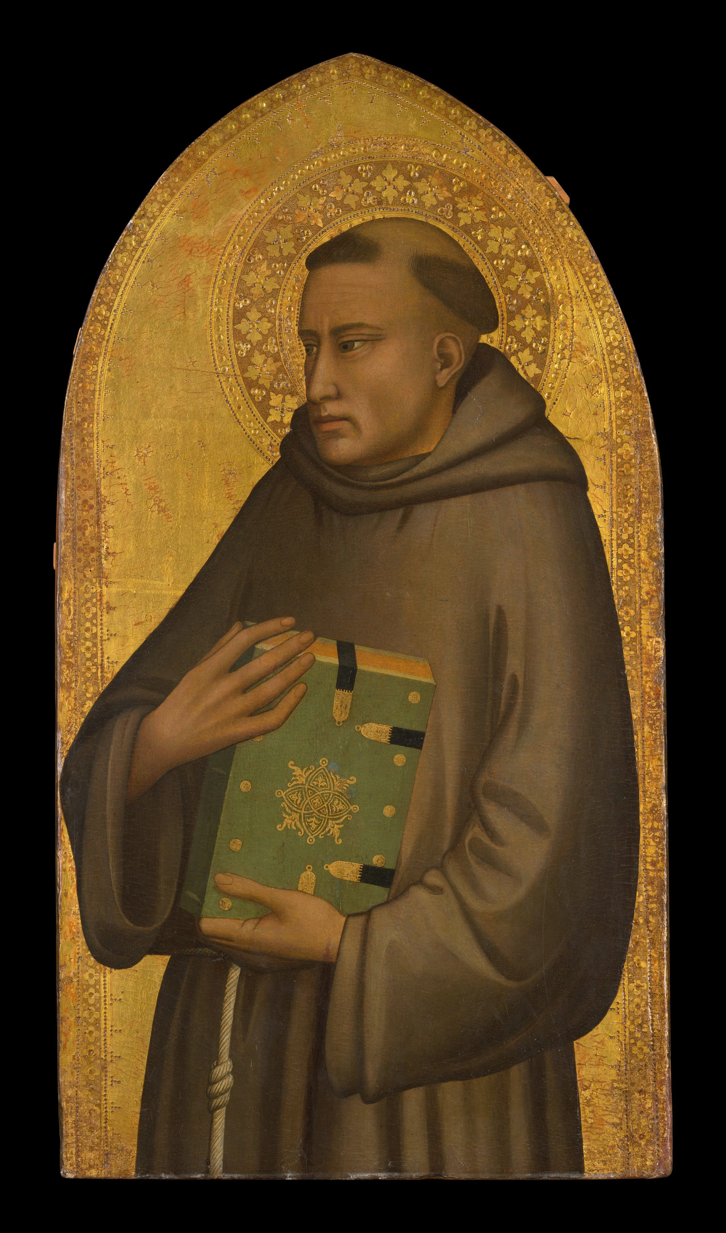
Maso di Banco, Saint Anthony of Padua, ca. 1340. Courtesy of the Metropolitan Museum of Art.
In the European Paintings galleries on the second floor of The Metropolitan Museum of Art, a smaller panel stopped me: Maso di Banco’s Saint Anthony of Padua. The background is monochromatic gold, set against the brown of the habit, a plain wool garment worn by Franciscan friars, with one color breaking the palette: the pale green of the book Anthony holds. As I am interested in the methodologies of formalism, iconography, and semiology, I will apply these distinct frameworks to the painting’s economy of color and the composition of the portrait. The panel functions as a posthumous likeness: a portrait created after the subject has died, where the artist must rely on memory, tradition, or imagination rather than a sitting model. Because Maso worked a century after Anthony’s 1231 death, he had no living model before him. Anthony was a Franciscan friar and preacher canonized within a year of his passing, and his representation relies on a fixed iconographic tradition.
Examined through a formalist lens, the composition signals two opposite realities. The ground is purely abstract, flat gold, tooled into a ring of small flowers around the saint’s head, reflecting the gallery light with an intensity the brown figure never reaches. The figure sits against this gold ground in heavy brown drapery, gathered in deep folds and tied at the waist with a knotted rope. The anatomy of the hands departs from this bulk: long, thin fingers, stylized rather than realistic, pressed against the green, gold-clasped book he holds. Ground and figure seem to belong to two different art historical periods, the Italo-Byzantine and the Proto-Renaissance. This single panel serves as a hinge between an older tradition that celebrated the spirituality of gilded backgrounds and a Renaissance that would celebrate high illusionism.
To address the semiotic layer of the panel, I will apply Charles Sanders Peirce’s triadic sign system: icon, index, and symbol. As an icon, the central figure operates not by mimicking a living model, but by generating a recognizable visual type through conventional features and the monastic habit. That iconic form leans on the innovations of Giotto, who advanced subtle tonal gradations that give the body sculptural weight and a sense of gravity, a real departure from the flatter forms of Cimabue. Yet Maso doesn’t abandon the older maniera greca. The gold ring around the head still functions first and foremost as a symbol for the uncreated light of divinity, a conventional sign that remains dominant even as its tooled floral motifs introduce a secondary iconic layer.
Locating the index in this panel requires a shift in analytical focus. A footprint is an index of a foot; a shadow is an index of an object; a photograph is considered to be, first and foremost, indexical. None of these conditions appear to be present here. Instead, I locate the index within the paint. The egg tempera registers the trace of Maso’s hand around 1340. Yet, because both the icon and the symbol emerge from these permanent marks on the wood, the status of the indexical mark becomes polemical. It is the raw pigment itself as mark and index that generates these two modes of signification.
Nearby, in a glass case, sits Giotto’s own small panel, The Adoration of the Magi (ca. 1320), where a rough wooden stable shelters the Holy Family. The museum’s scholarship notes that Giotto used that structure to experiment with perspective, testing how architecture could generate the illusion of space. The museum describes Maso as “the greatest pupil” of Giotto and points to the “weight and gravitas” of this figure. Standing between the two panels exposes how this stylistic inheritance was passed down: Giotto testing perspective through a wooden shed, and Maso testing mass through a single robed body suspended across flat gold.
Juan de Flandes: Surfaces and Spaces
By Daeun Yang
What drew me to Juan de Flandes's Christ Appearing to His Mother in the Met's European Paintings galleries was that it appeared as a micro-museum, tying painting, sculpture, and architecture together as equally compelling ways of defining space and representing iconographic narratives. Within its narrow wooden frame, it operates as a poetic, miniature Wunderkammer. Sculpted stone figures and a vaulted chapel are all rendered in oil, so that the panel becomes a self-contained gallery within the Early Netherlandish galleries around it.
Measuring just over two feet tall, Juan de Flandes's panel uses a painted Gothic stone archway to frame the resurrected Christ and the Virgin Mary in a vaulted foreground, while opening onto a background scene of the Resurrection. Rather than adhering to Albertian linear perspective, the composition tilts the floor plane toward the picture surface, accommodating two biblical episodes, separated in time, within a single pictorial space. Space is constructed additively: the orthogonals of the floor tiling and rib vaulting do not converge at a single vanishing point, and each space is defined on its own terms.
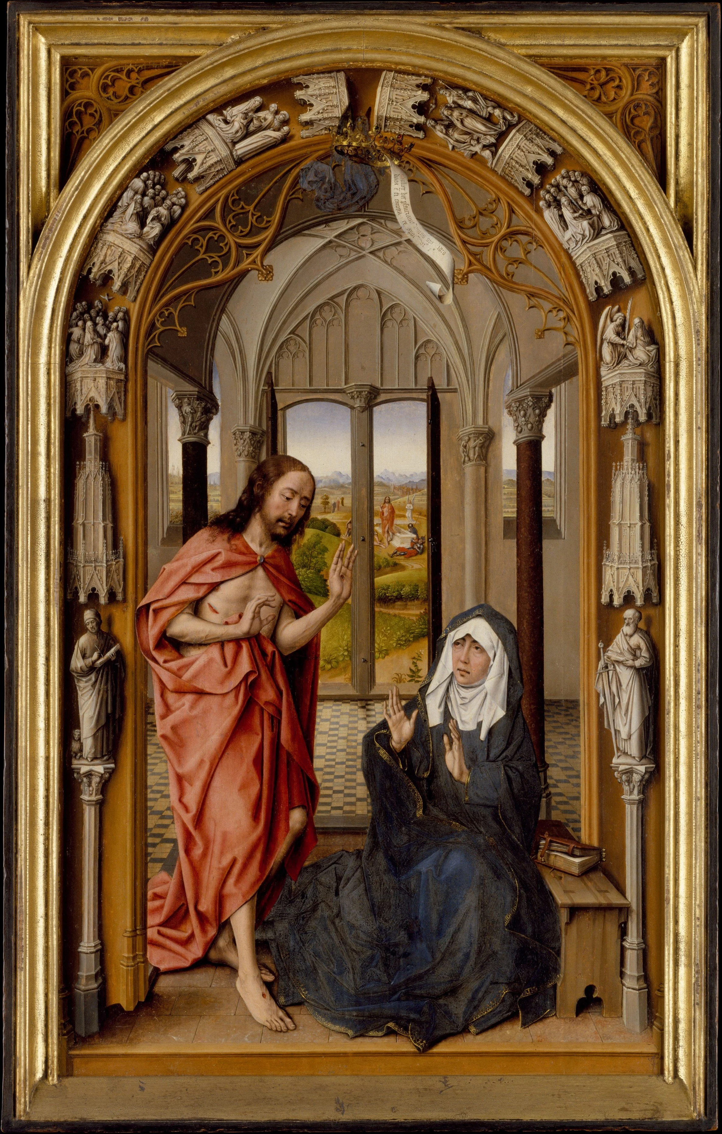
Juan de Flandes, Christ Appearing to His Mother, ca. 1496. Courtesy of the Metropolitan Museum of Art.
The rendering of surfaces extends even to the painting's architectural fiction. In the archivolt, Juan de Flandes paints carved stone relief in grisaille, shades of gray that imitate sculpture without any carving: Saint John and Saint Paul, scenes of the Virgin's Assumption and Pentecost, and, on the flanking columns, Old Testament reliefs including David and Goliath. The same attention reaches the grain of the stone arch, the tear on the Virgin's cheek, and the open wound on Christ's torso, details that served late medieval devotional prayer. Christ's mantle, a warm vermilion that pales to light coral where light falls across its folds, stands out against the Virgin's robes, a blue so deep it reads as black.
In the next-door gallery, I began staring at Botticelli's Three Miracles of Saint Zenobius. Both panels date to around 1500, and both illustrate sacred narratives, yet their forms of representation intersect as much as they diverge. Where Juan de Flandes builds space additively, Botticelli stages his miracles within a legible Florentine streetscape, its vanishing point located where the contours of two distant hills meet and a solitary tree stands. The two share what art history calls continuous narrative. I prefer to call it multiple narratives, since each depicted moment carries its own story, gathered within a single image: Christ at the tomb and Christ before his mother, or each of Zenobius's miracles. Juan de Flandes holds his moments together without a single fixed viewpoint, his space additive rather than resolved. Botticelli gathers his beneath one Albertian perspective, each miracle unfolding along the same coherent street, as though history itself had been laid out to scale.
Andrea del Sarto: Disegno, Colorito, and Civic Symbol
By Hanyu Zhu
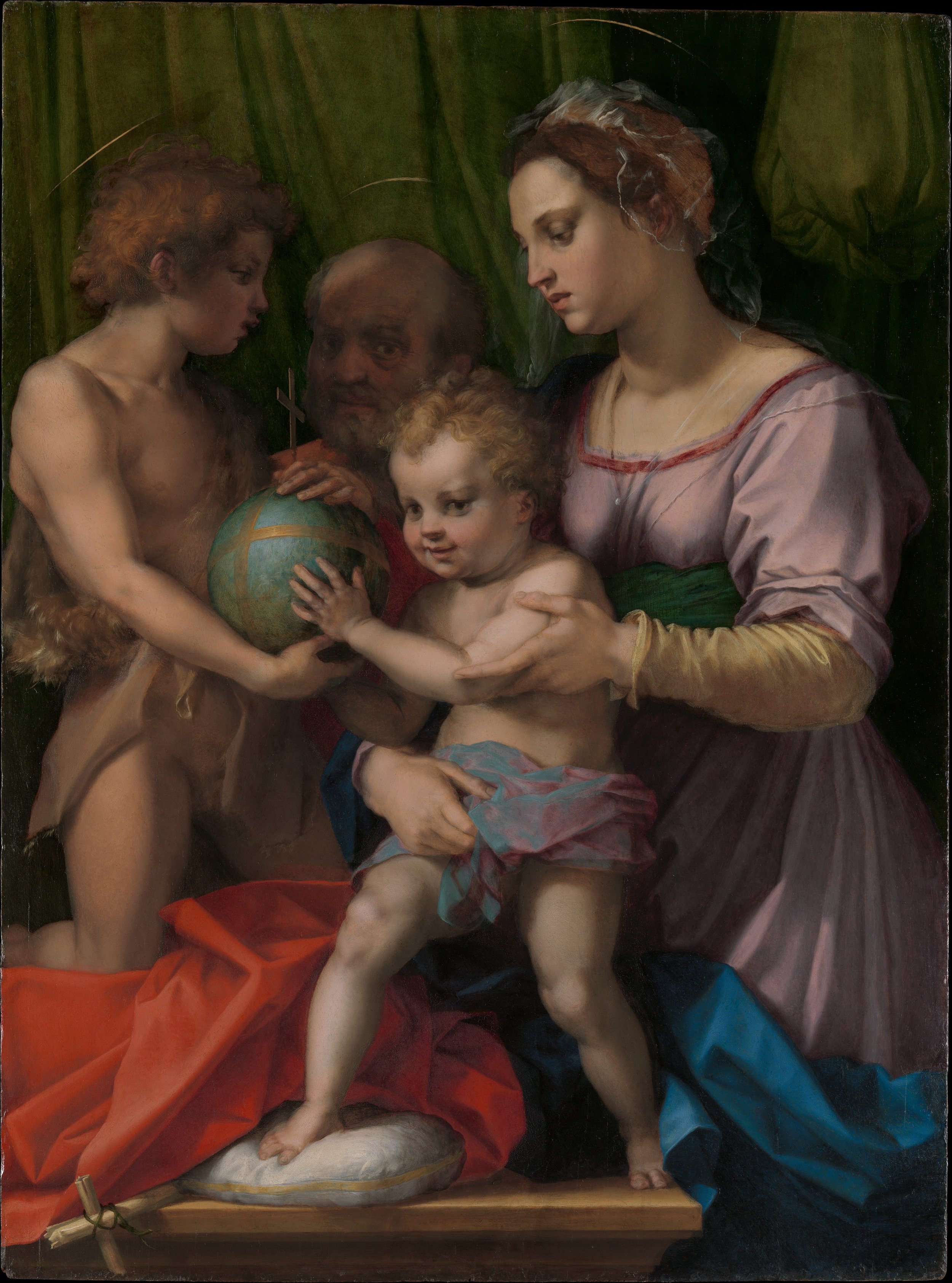
Andrea del Sarto, The Holy Family with the Young Saint John the Baptist, ca. 1528. Courtesy of the Metropolitan Museum of Art.
A central debate of sixteenth-century painting lies in the tension between disegno and colorito.¹ In Gallery 609 at the Metropolitan Museum of Art, Andrea del Sarto's The Holy Family with the Young Saint John the Baptist commands attention because it exists at the exact crossroads of this debate. Painted on a large wooden panel around 1528, the work demonstrates the legacy of early geometric modeling and humanism. While the figures possess the structural clarity of Florentine disegno, their physical connections rely on a rich, painterly colorito. Seen through Heinrich Wölfflin's formalist framework, the panel anticipates the historical transition from the linear to the painterly, illustrating his distinction that linear vision sees in lines, while painterly vision sees in masses. Rather than binding the Holy Family within rigid outlines, del Sarto utilizes sfumato to resolve the boundaries of the figures into heavy, volumetric masses of light and shadow. This formal tension is crystallized in the painting's shallow, architecture-free space, where a muted background curtain defines the spatial boundary while saturated blocks of red and blue fabric construct the foreground. By compressing the spatial plane, del Sarto bypasses traditional deep perspective and projects the dense figures forward toward the picture plane.
This spatial compression isolates a central, shared action: a solid globe held aloft by the hands of three figures while the dominant Madonna anchors the right side of the panel, holding Christ. By rendering this orb not as a transparent mathematical abstraction but as a heavy, opaque mass passed by John the Baptist, the patron saint of Florence, to the Christ child, del Sarto turns the painting into a specific political sign of its time. This physical transaction grounds the entire image in the turbulent social context of the short-lived Florentine Republic, revealing, as the Met's entry notes, that the material presence of a civic symbol was actively being deployed to declare Christ, and not the exiled Medici family, as the sole ruler of the city.
¹ I retain the original sixteenth-century Italian terms disegno and colorito because English translations like "drawing" and "color" strip away their specific theoretical weight. In my analysis, I use disegno to denote not merely linear contour, but the intellectual concept and structural planning championed by Giorgio Vasari in Florence. Conversely, I use colorito to refer to the Venetian method codified by Ludovico Dolce: the optical construction of volumetric mass, light, and atmosphere directly through the material application of pigment, rather than the simple filling-in of a pre-established outline.
Caravaggio: Painting Vision
By Jade Thomas
Youth, music, and existential opulence: these were what first drew me to Caravaggio's The Musicians. Yet beyond its sensual surface, the canvas operates as a compact summary of formal techniques. Caravaggio demonstrates a mastery of volumetric modeling, emphatic chiaroscuro, and even a subtle Mannerist tendency, evident in the elongated, intricate hand position of the figure tuning the lute. While the presence of Cupid confirms an allegory of Music, the Met caption notes that Caravaggio depicted himself in the second figure from the right, looking directly out at the viewer. This direct gaze transformed how I saw the entire composition.
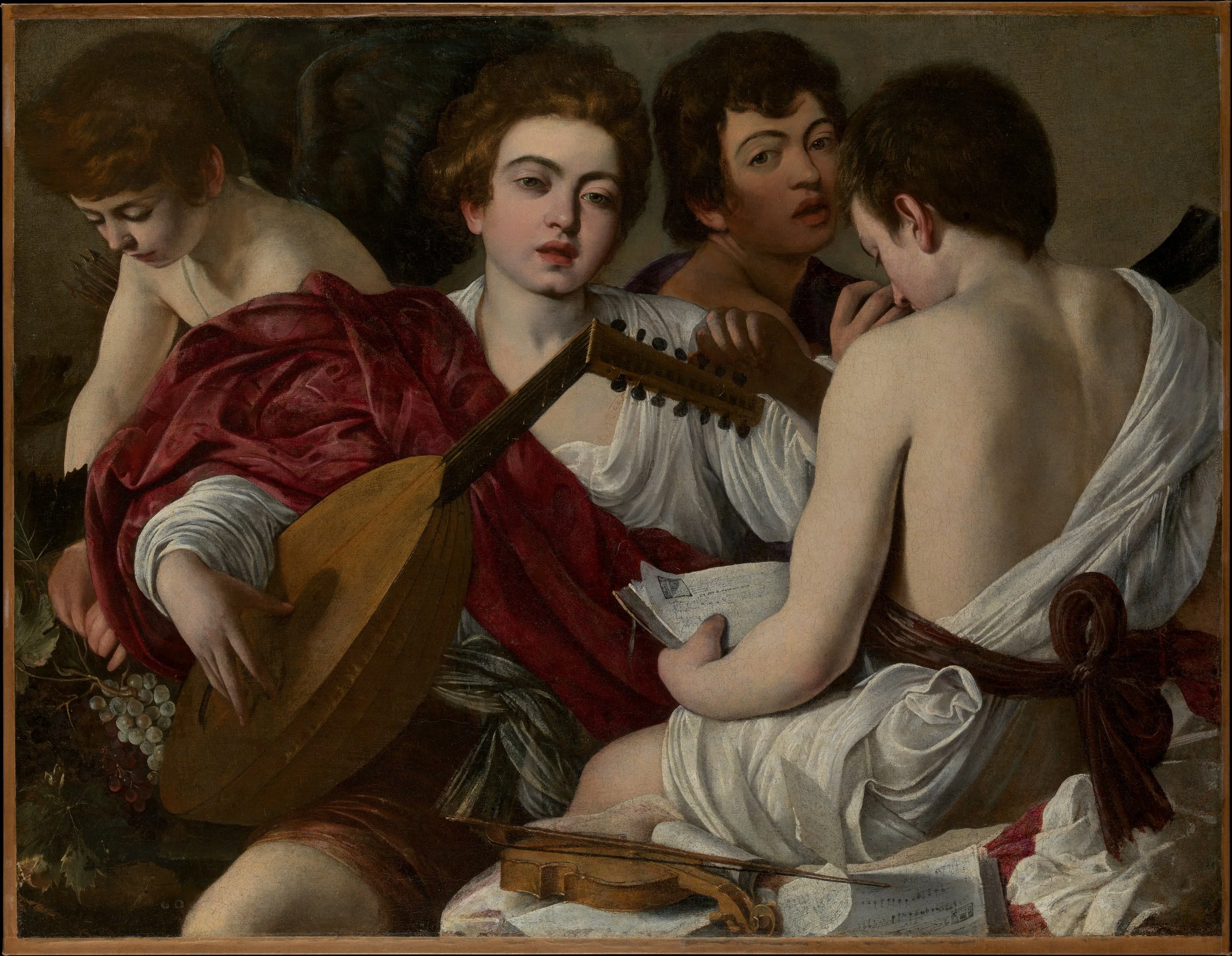
Caravaggio, The Musicians, 1597. Courtesy of the Metropolitan Museum of Art.
The whole painting seems to me to be about sight and its points of focus. Cupid looks down at his grapes, the boy at the right reads his music, the lute player looks out with a soft, unfocused gaze, and the boy behind him stares straight at me. In the foreground, the sheet of music appears upside down from where I stand, its notes legible only if I turn them around in my mind. Could Caravaggio be staging, perhaps unknowingly, the inverted image that forms on the retina? Optics had not yet explained it; only in 1604, seven years after this painting, did the German astronomer and mathematician Johannes Kepler show that the eye receives the world upside down. The musical score reminded me of Svetlana Alpers' account of Kepler's optics, in which the picture formed on the retina is "upside down and reversed." Kepler, she writes, "turns away from the actual world to the world 'painted' there."¹ Cupid's grapes hold small points of reflected light, round and translucent like the catchlight in a pupil. Perhaps here light, rather than the brush, becomes the agent of the image.
I began to read the ensemble as an implicit allegory of painting itself. The lute functions as the artist's palette and brush; the scattered musical scores in the foreground represent raw pigment waiting to be arranged; and the surrounding figures act as the life models. Of all these gazes, only Caravaggio's locks onto ours. In doing so, he turns a musical rehearsal into a double self-portrait—a testament to both the musician among musicians and the painter constructing his image.
¹ Svetlana Alpers, The Art of Describing: Dutch Art in the Seventeenth Century (Chicago: University of Chicago Press, 1983), 36–37.
Caravaggio: Religion and the Process of Observation
By Morgan Little
What struck me first in Caravaggio's The Holy Family with the Infant Saint John the Baptist was how the unyielding verism of the figures confronts the viewer, operating alongside a dark, enveloping tenebrism that dissolves the background and interstice between the bodies of Jesus and Mary into pure spatial abstraction. This elimination of contextual environment highlights what seems to me the artist's prophetic modernism, converting shadows into autonomous painterly fields.
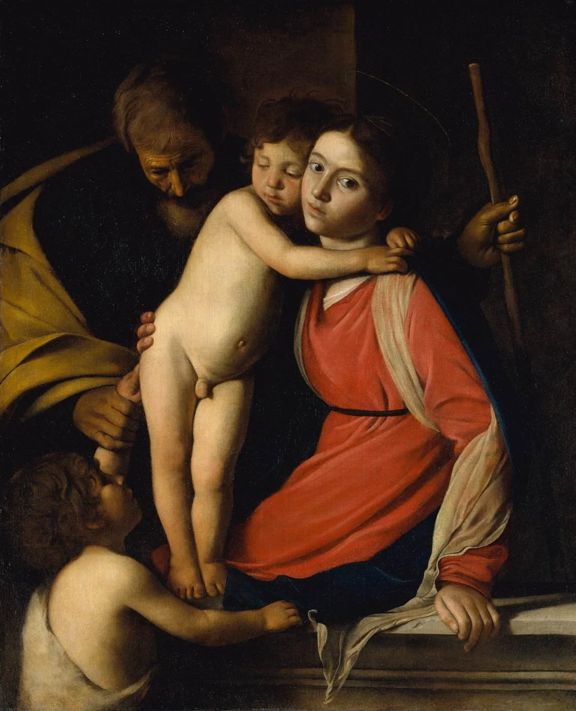
Caravaggio, The Holy Family with the Infant Saint John the Baptist, early 1600s. Private collection, on loan to The Metropolitan Museum of Art.
Iconographically, Mary's face presents a piercing emotional gravity; her gaze is directed candidly toward both the artist and the viewer, breaking the pictorial plane to transform a sacred devotional scene into an immediate, existential encounter. In contrast, Joseph is positioned in the shadowed backdrop, partially obscured in a state that reflects Heinrich Wölfflin's concept of relative clarity. In the Baroque, he writes, "the appearance of the image no longer coincides with the maximum of representational clarity. It avoids it."¹ Here, open visual focus allows the eye to linger on a primary point of observation while the surrounding form yields to abstraction, never closing off interpretation but leaving Joseph's presence fluid, atmospheric, and open to the viewer's active perception. Furthermore, the deep, glowing wine-red of Mary's gown, the muted dark-mustard mantle of Joseph, and the exposed, vulnerable flesh of Christ and John operate as chromatic emblems—a visual threshold where the viewer becomes a psychological mirror image of Mary's haunted gaze.
In this way, the composition radically departs from both the intellectual geometry of the Renaissance and the contorted ambiguities of Mannerism. Abandoning the rigid Albertian perspective of architecture, Caravaggio organizes the picture around points of focus, as the eye does in a single moment of looking. What the eye cannot hold in that instant falls into shadow. These out-of-focus regions become his abstractions. The moment is staged, chosen by the painter as a director lights a scene. Yet the unidealized bodies it reveals keep that staging from becoming mere artifice.
¹ Heinrich Wölfflin, Principles of Art History: The Problem of the Development of Style in Early Modern Art, trans. Jonathan Blower (Los Angeles: Getty Research Institute, 2015), 274.
Caravaggio and Peripheral Vision
By Crislenny Paulino
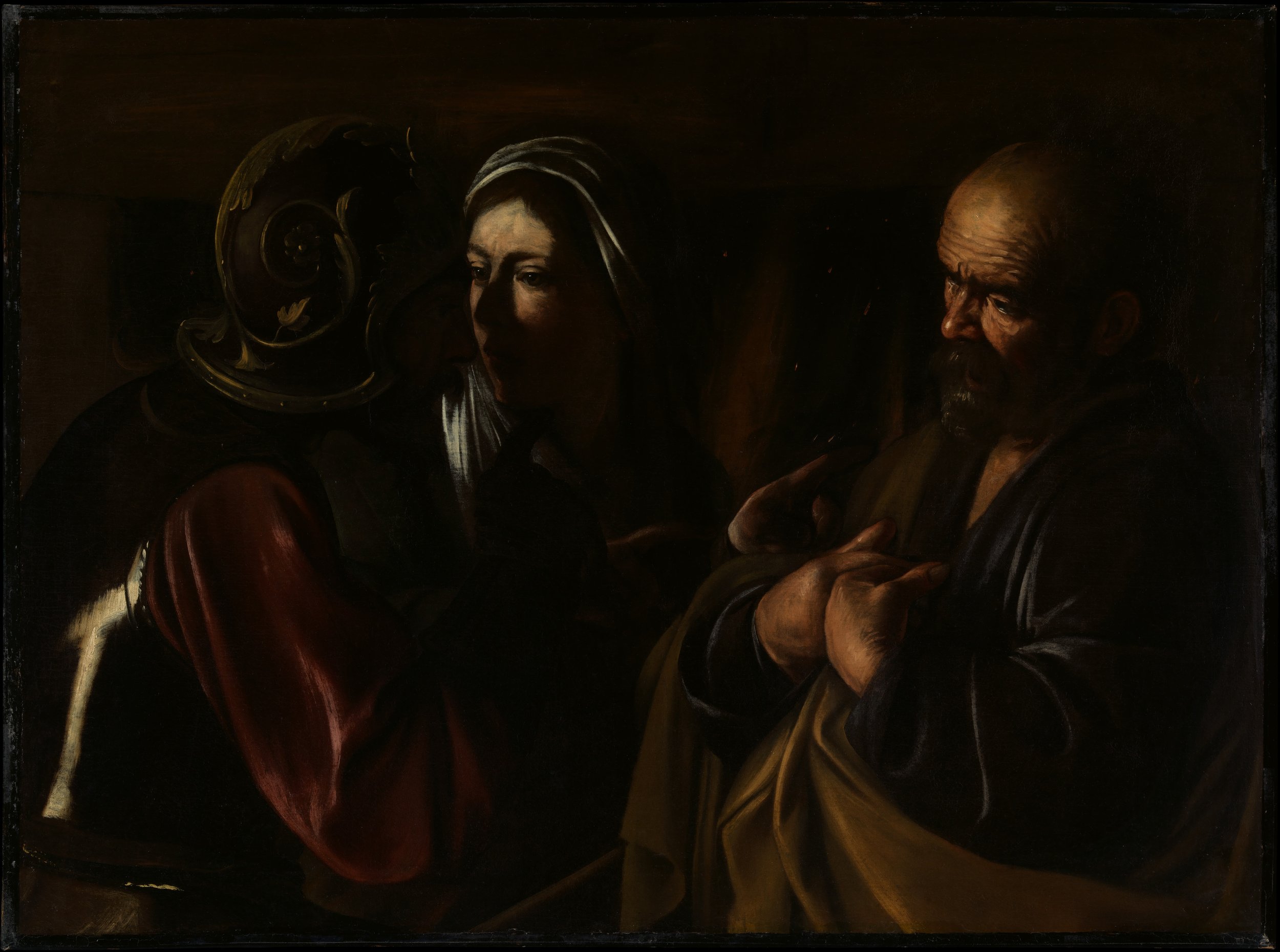
Caravaggio, The Denial of Saint Peter, 1610. Courtesy of the Metropolitan Museum of Art.
Hung in the Metropolitan Museum of Art's gallery Italian Baroque: "To Destroy Painting," Caravaggio's The Denial of Saint Peter intensifies both the iconographic narrative and the phenomenological dimension of human vision. Rather than treating tenebrism merely as a dramatic lighting technique, Caravaggio employs his deep, swallowing shadows to encapsulate the very mechanics of how we perceive the world. The central point of focus—the accusing finger of the soldier and the trembling, defensive gesture of Peter—demands a crisp, sharp clarity that draws the foveal gaze directly into the psychological core of betrayal. Yet surrounding this focal point, the forms dissolve into dark, broad passages of raw, painterly brushwork, mimicking peripheral vision where detail gives way to a form of natural abstraction. In this way, Caravaggio aligns the act of viewing a canvas with the biological reality of sight itself.
The tension between revealing and withholding form is what Heinrich Wölfflin saw as the Baroque's break with classical art, which had bound beauty to the complete revelation of form. Caravaggio does not obscure his figures to confuse the narrative, but rather to ground the dramatic confrontation in an authentic, fleeting human experience. By employing visible, unpolished brushstrokes across the picture surface, he ensures that clarity never feels artificially constructed. Instead, he fulfills Wölfflin's ultimate definition of the Baroque ethos: "If classical art set itself the goal of disclosing the motif in perfect clarity, then the baroque, though it does not exactly want to be unclear, nevertheless wants its clarity to appear as though it were merely an accidental by-product."¹
The gallery's title quotes Nicolas Poussin's reported verdict that Caravaggio came into the world "to destroy painting." The Denial of Saint Peter suggests the opposite: its dissolving periphery is not a destruction of painting but a construction, a picture built on the way the eye actually sees.
¹ Heinrich Wölfflin, Principles of Art History: The Problem of the Development of Style in Early Modern Art, trans. Jonathan Blower (Los Angeles: Getty Research Institute, 2015), 284.
Two Hands, One Panel, Metamorphosis
By Yutong Liu
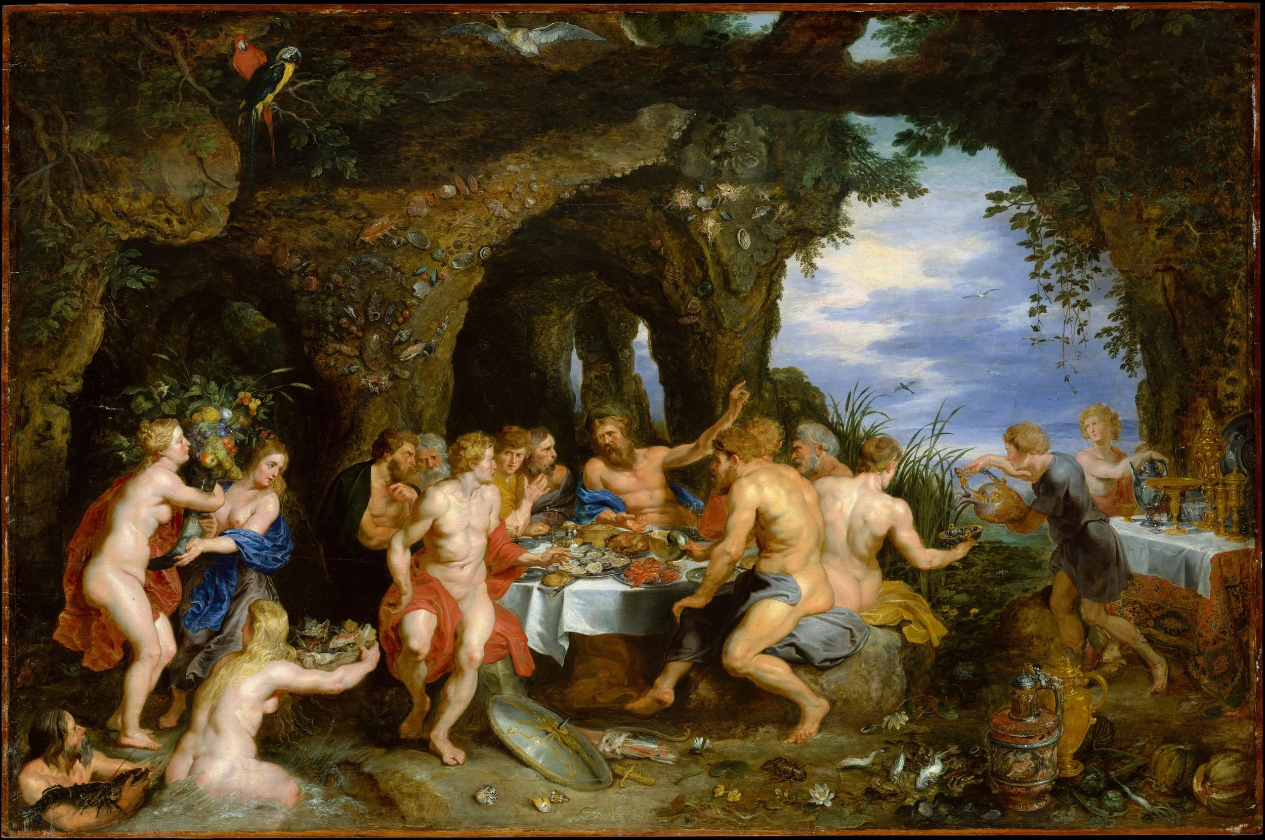
Peter Paul Rubens and Jan Brueghel the Elder, The Feast of Acheloüs, ca. 1615. Courtesy of the Metropolitan Museum of Art.
Two distinct stylistic modes meet within a single oak panel in The Feast of Acheloüs, and I am left openly wondering how they merge. While Heinrich Wölfflin's categories usually describe a single, unified way of seeing within a painting, this collaboration presents a fascinating exception to the rule, transforming Wölfflin's opposing categories of the linear and the painterly into a simultaneous, live dialogue. Peter Paul Rubens's figures gathered at the feast are painterly through and through, defined by open contours, warm flesh, and fluid motion. In contrast, Jan Brueghel the Elder's execution of the surrounding grotto and still-life tableware leans toward the linear, maintaining razor-sharp draftsmanship despite his atmospheric glazes.
As I looked into the dark, cavernous grotto, watching forms emerge from subterranean shadow into flickering light, I wanted to speculate beyond traditional art history. What if the painting's spatial architecture operates as a philosophical emblem of style itself? In this light, Ovid's myth of metamorphosis becomes an allegory for the past, present, and future of stylistic evolution as formulated by Wölfflin. The distant, petrified island represents the past, a fixed, linear monument frozen in space; the river god's banquet embodies the present, the active, painterly fluidity of the early Baroque moment; and the voluptuous female nude reclining in the lower left, rendered with luminous, pearlescent warmth, acts as the future, an early precursor anticipating the soft, atmospheric nudes of Auguste Renoir nearly three centuries later. Or could it be that Renoir himself left Impressionism behind in order to return to a far past?
Paint and Politics
By Qiyan Xie
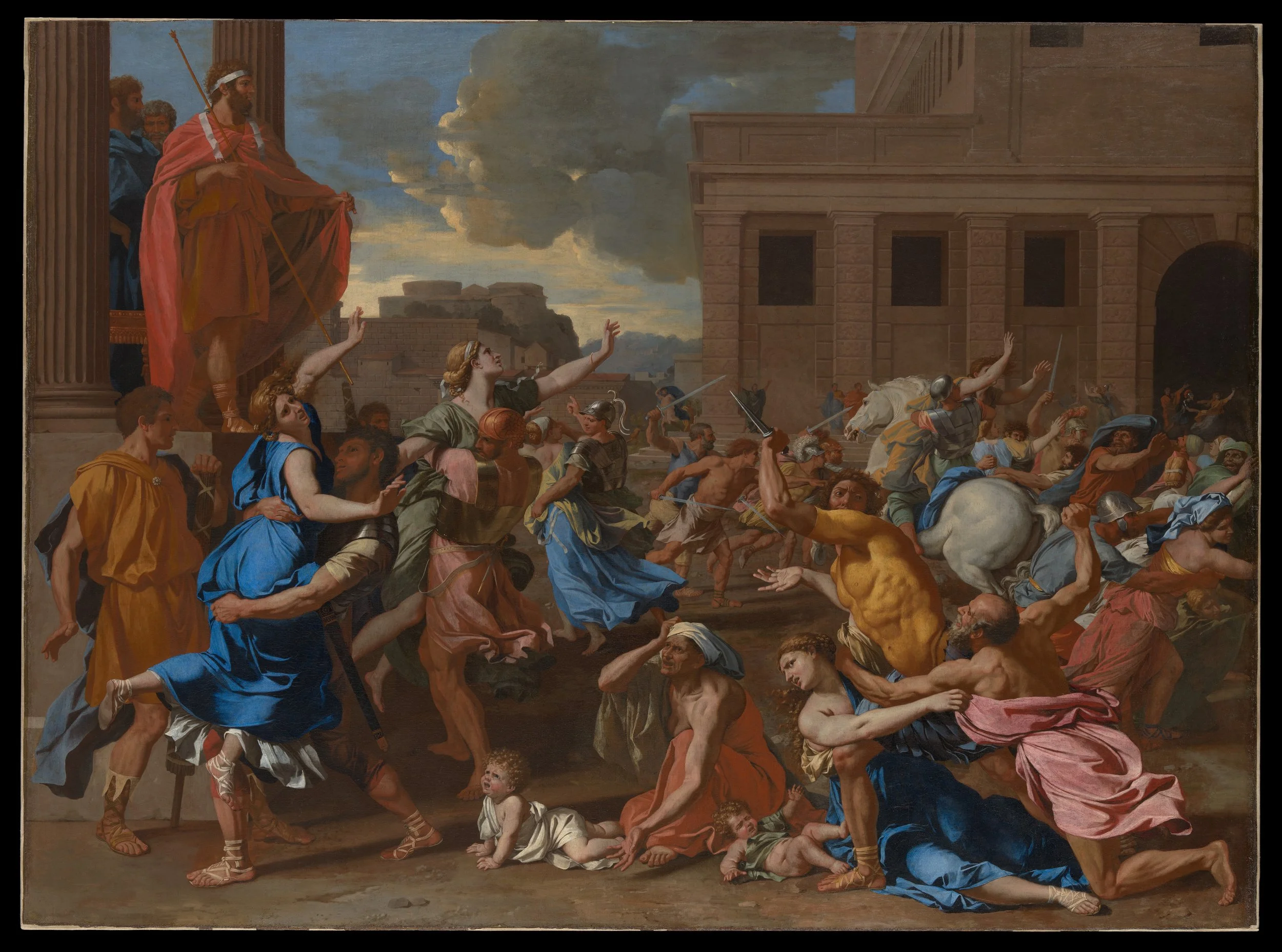
Nicolas Poussin, The Abduction of the Sabine Women, probably 1633–34. Courtesy of the Metropolitan Museum of Art.
A striking paradox runs through Nicolas Poussin’s The Abduction of the Sabine Women (probably 1633–34), in Gallery 623 of The Metropolitan Museum of Art: in the frantic tangle of twisting limbs and terrified faces, acute human terror is locked within an unyielding geometric order. The composition illustrates a founding myth of ancient Rome, the moment Romulus raises his red cloak to signal his warriors to seize the Sabine women as wives. Yet the scene reads less like an unscripted riot and more like a calculated, artificial stage theater. Rather than letting the violent chaos dissolve the pictorial structure, Poussin subjects the crisis to a closed, tectonic order, precisely what Baroque taste resisted. As Heinrich Wölfflin writes, “Where the tectonic framework shows through all too clearly, this is perceived by the baroque as rigid and contrary to the idea of a living reality.”¹
To understand Poussin’s spatial control, one must look back to the Renaissance ideal of rational space, exemplified by works such as Fra Carnevale’s The Ideal City (ca. 1480–84), which constructs an imaginary urban square through strict central perspective. Poussin revises this Renaissance paradigm: the right side of his canvas recedes into a rigid block of classical architecture, while the left opens onto a dramatic sky. Against this architectural backdrop, the figures do not move fluidly; rather, they freeze like statuary. Poussin famously designed his compositions by placing small wax figures draped in paper onto a miniature stage inside a box to manipulate light and shadow. Read against that working method, the violent abduction reveals its theatrical mechanics—a series of freeze-frame poses calculated to maintain absolute spatial clarity.
I cannot help but feel that the terror unleashed by Romulus’s decree runs parallel to the upcoming civil wars of the Fronde that would shake mid-seventeenth-century France.² In this light, Poussin’s rigid composition reads as a precursor to the Neoclassical style, foreshadowing Jacques-Louis David’s The Death of Socrates (1787), which hangs in a gallery whose wall text is headed Revolution. Both set extreme events, an abduction and an execution, within a disciplined classical order, and both were read politically in the France of their day.
¹ Heinrich Wölfflin, Principles of Art History: The Problem of the Development of Style in Early Modern Art, trans. Jonathan Blower (Los Angeles: Getty Research Institute, 2015), 206.
² For more on the politics of Poussin’s style in France, see Todd P. Olson, Poussin and France: Painting, Humanism, and the Politics of Style (New Haven: Yale University Press, 2002).
Charles Le Brun: Syntax and Narrative
By Alver Mera
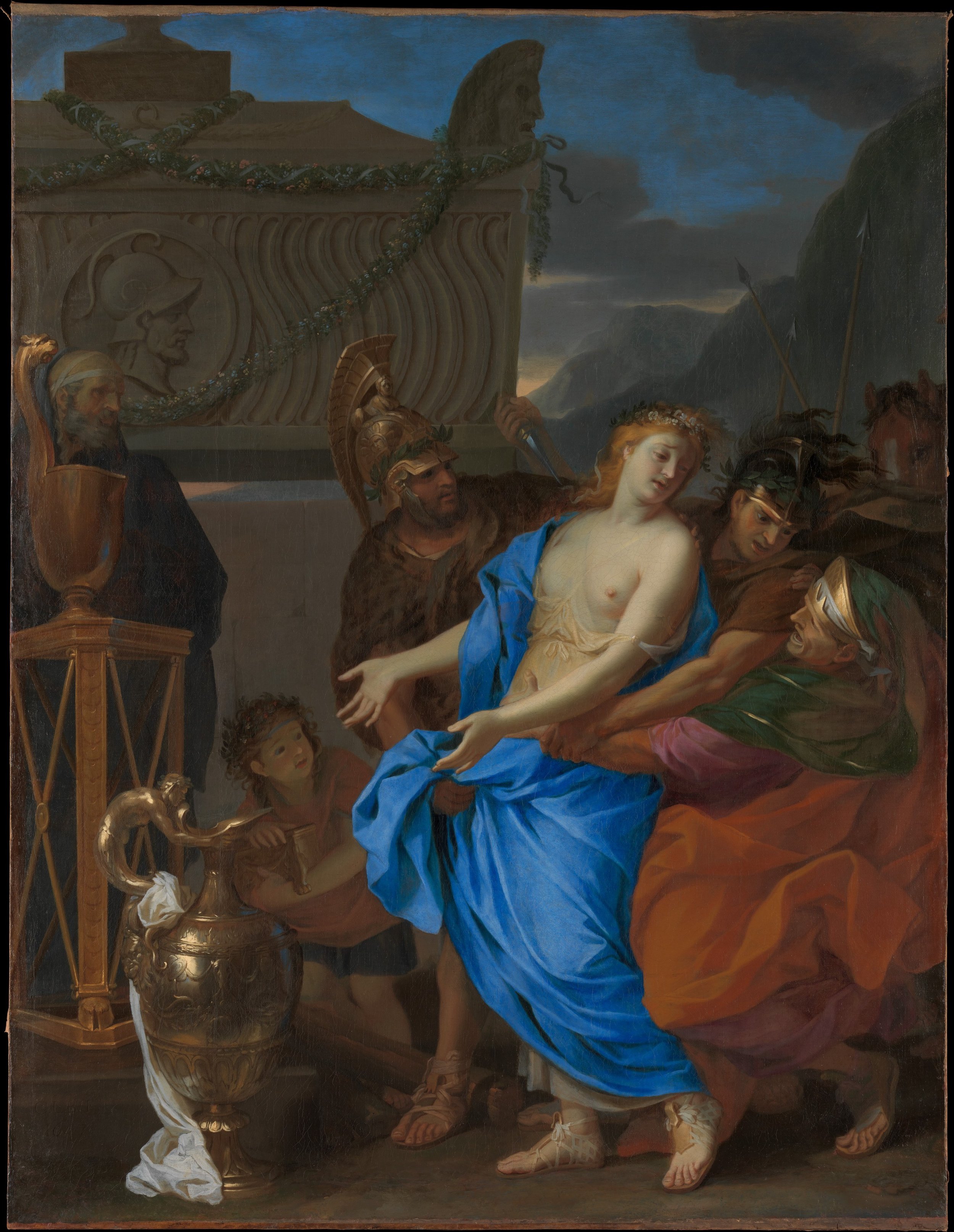
Charles Le Brun, The Sacrifice of Polyxena, 1647. Courtesy of the Metropolitan Museum of Art.
Charles Le Brun's The Sacrifice of Polyxena reads to me as an early model of the synthesis of disegno and colorito that the French Royal Academy, founded the following year, would make its doctrine. Painted a year before Le Brun helped found the Royal Academy, the lower register of the composition operates with strict allegiance to drawing and intellectual calculation. Here, the stoic, doomed Trojan princess and her executioners are sculpted with crisp contours and hard-edged clarity, displaying the precise physiological muscle movements that Le Brun would later outline in his famous lecture on emotional expression.¹ The pathos of her tragedy is communicated through rehearsed, legible gestures that remain firmly bound to a linear, closed framework.
As my eye travels upward past the classical altar, the rigid grid of the figures gives way to a surprisingly soft, atmospheric painterliness. The upper part of the composition, where smoky sacrificial plumes swirl against a restless, cloud-filled sky, demonstrates a controlled use of fluid brushwork and loose contours where individual form is purposefully subjugated to a unified, atmospheric mood. By organizing his canvas between the linear precision of human anatomy below and the atmospheric colorism of the sky above, Le Brun shows how a true classicist orchestrates the grand, theatrical fluidity of the Baroque epoch without ever sacrificing structural order. Although my initial intent was to subject this canvas primarily to Wölfflin's formalist theory, the dramatic gravity of the narrative turned out to be equally compelling—as if to prove that Le Brun's formal structure ultimately exists to serve his storytelling.
¹ For Le Brun's lecture on the expression of the passions, see Jennifer Montagu, The Expression of the Passions: The Origin and Influence of Charles Le Brun's "Conférence sur l'expression générale et particulière" (New Haven: Yale University Press, 1994).
Vermeer's Space Upon the Plane
By Emi Wu
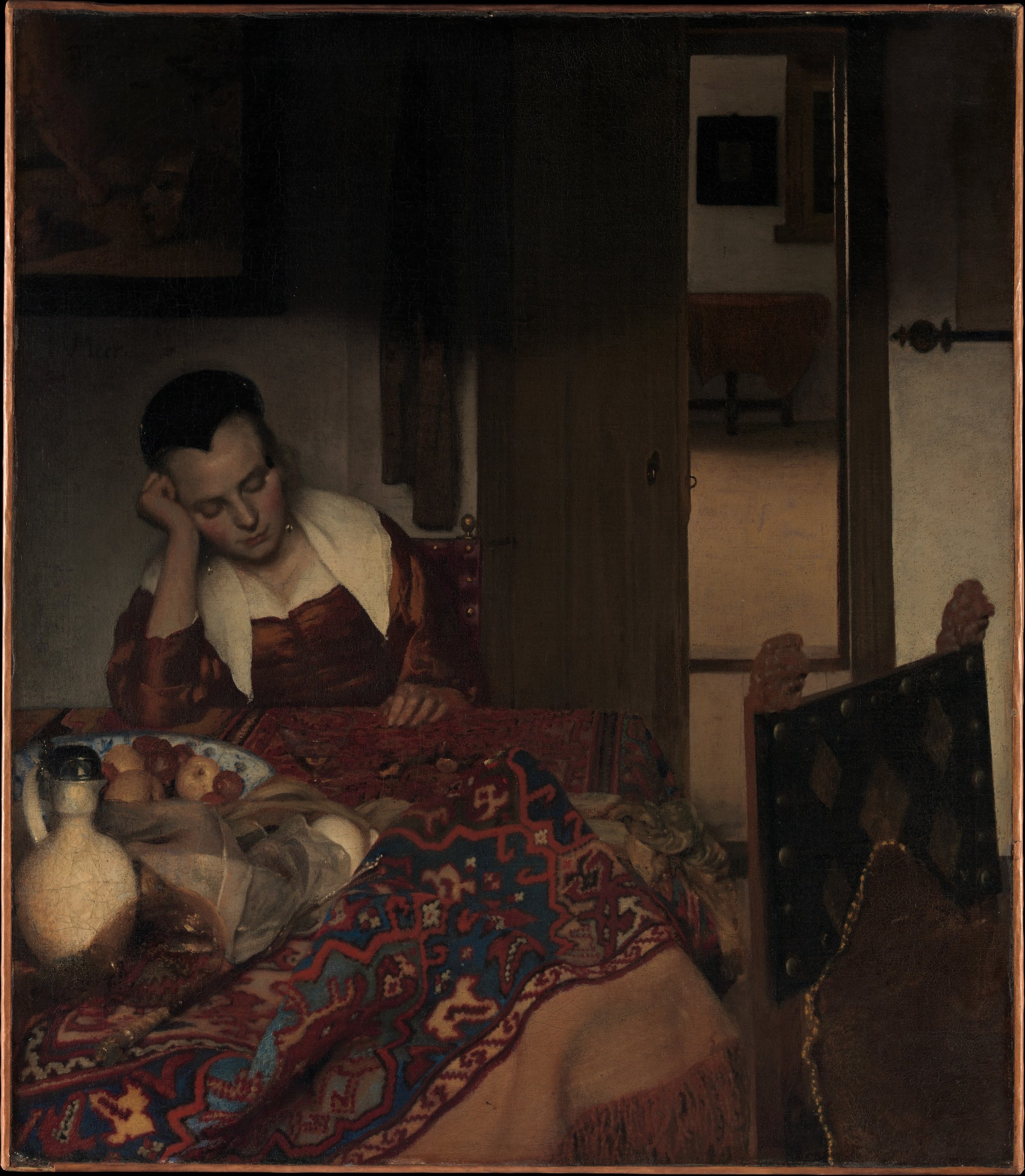
Johannes Vermeer, A Maid Asleep, ca. 1656–57. Courtesy of the Metropolitan Museum of Art.
Johannes Vermeer's A Maid Asleep held my attention as a study of space and surface. Vermeer first builds a convincing depth: a heavy oriental rug is pulled forward over the table, and a partial doorframe leads into a second room. The painting hangs in a gallery evocatively titled "Behind Closed Doors," but here the door stands open, and through it we look into the room beyond. As I kept looking, this recession also began to read as a pattern on the surface, with the dark doorways and the edges of the furniture becoming rectangles as well as openings into space. Having studied Albertian perspective, I expected it to organize this room. It does not fully disappear, but it no longer governs the picture alone, and the rumpled still life on the table settles into a deliberate design.
Vermeer's handling of the table reminded me of Paul Cézanne's still lifes, such as his Still Life with a Ginger Jar and Eggplants (1893–94) at the Met and his Apples and Oranges (ca. 1899) at the Musée d'Orsay. Cézanne would later use draped tablecloths to press depth toward the picture plane, and Vermeer's crumpled rug likewise flattens its folds into a pattern of planes. Heinrich Wölfflin's distinction between the linear and the painterly applies here as well: the background textiles are soft and painterly, while the maid's face keeps a clear, linear precision.
Vermeer lights the two spaces separately, with one source falling on the sleeping woman and another on the room beyond the doorway. Only after reading Svetlana Alpers did I connect the soft, almost projected quality of this light to the camera obscura, a device studied in Johannes Kepler's time that Vermeer may have used.¹ The sleeping woman then began to look to me like an image of Vermeer himself, a figure with closed eyes at the center of a painting about the visible world. Without a clear story, what remains is an arrangement of surfaces, shapes, and light.
¹ Svetlana Alpers, The Art of Describing: Dutch Art in the Seventeenth Century (Chicago: University of Chicago Press, 1983), esp. the chapter titled "'Ut pictura, ita visio': Kepler's Model of the Eye and the Nature of Picturing in the North." Alpers' Latin, adapting Horace's ut pictura poesis, translates as "as is the picture, so is sight." Alpers discusses how northern painters like Vermeer constructed images through a descriptive, optical eye, akin to the camera obscura's projection, treating the picture as a surface on which the world is described, much like a map, rather than as Albertian narrative space.
REVISION IN PROGRESS
Light and Reflection in Vermeer
By Santiago Artagaveytia
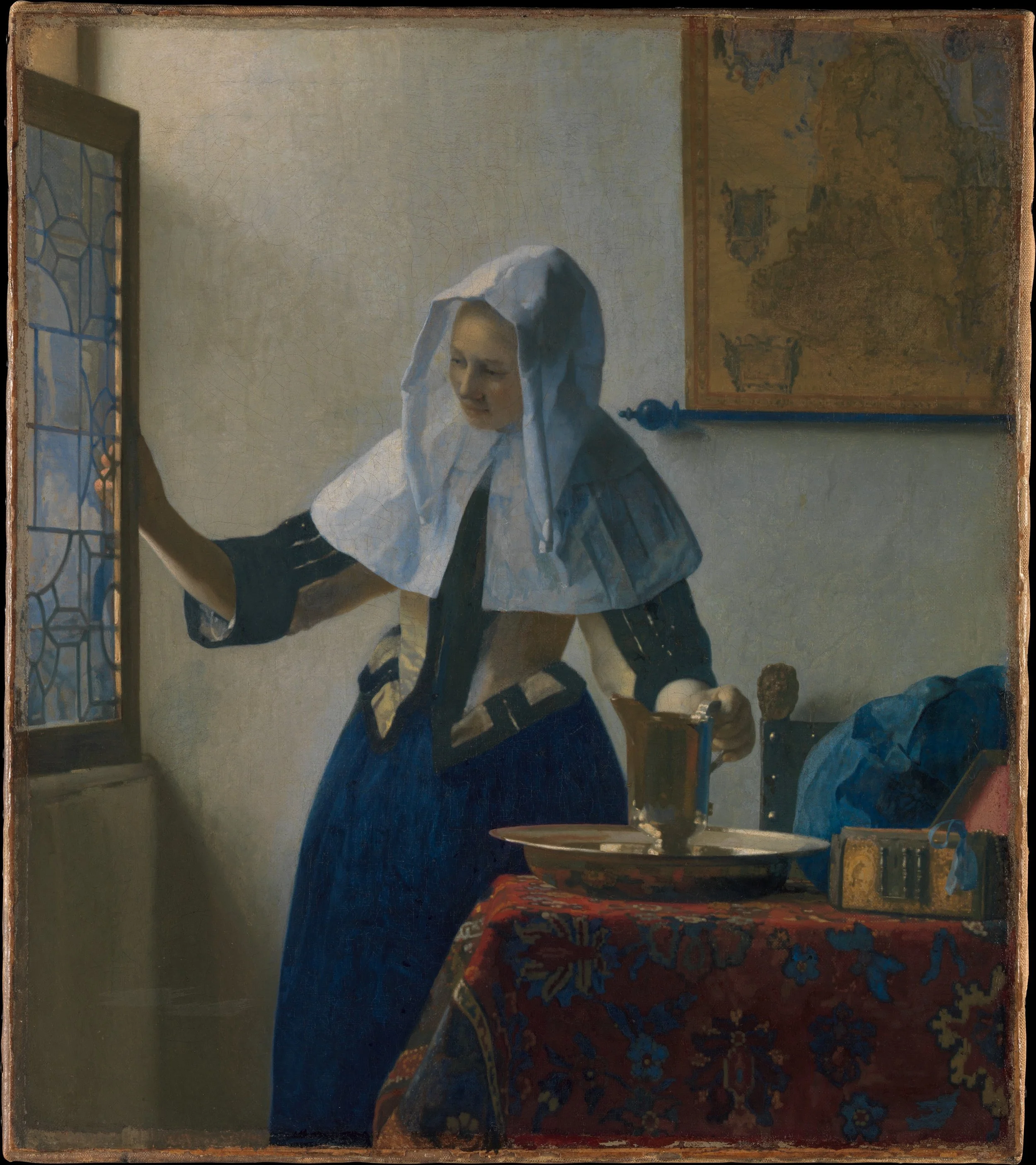
Johannes Vermeer, Young Woman with a Water Pitcher, ca. 1662. Courtesy of the Metropolitan Museum of Art.
A woman opens a window casement, her hand resting lightly on the brass frame while her other hand touches the handle of a silver-gilt pitcher. Standing in the Met’s European Paintings galleries before Johannes Vermeer’s Young Woman with a Water Pitcher, I found myself looking not just at a quiet domestic morning, but at an orchestration of light and sight. The angled window opens the interior to the outside world, while the curved pitcher on the table catches soft reflections, mapping the room back onto itself. Look closely, and the space begins to function like a live optical chamber. The window acts as an aperture regulating incoming light, while the metal surfaces gather that light into condensed, legible shapes.
To construct this quiet interior, Vermeer worked across two distinct visual traditions: hand-calculated geometry and optical projection. On one side sits Dürer’s manual method, mapping sight through a gridded wire frame without a lens. On the other lies the history of optics, running from Alhazen’s eleventh-century studies of the dark chamber to Johannes Kepler’s 1611 Dioptrice. Scholars who reject the idea that Vermeer relied on a camera obscura point to physical evidence on his canvases: small pinholes at the vanishing points with taut, chalked strings used to snap linear perspective lines onto the ground layer.¹ Yet the soft, pooled highlights along the pitcher and linen headcloth suggest the diffused, painterly glow of a projected image. Rather than proving the exclusive use of a single device, the painting lives in the tension between Dürer’s linear framework and the soft, dissolved contours of optical sight.²
This technical discipline serves a specific kind of viewing. In the Met’s gallery grouping titled Behind Closed Doors, the wall text notes that artists like Vermeer often adopted a detached vantage point, recording women in private moments for unseen viewers.³ Vermeer’s pairing of hands and eyes—the woman’s hand steadying the pitcher while her downward gaze remains in sharp focus—operates as a quiet metaphor for the painter at work. As Svetlana Alpers demonstrates in her study of Northern descriptive art, seventeenth-century Dutch painting operated through what she calls “a sincere hand and a faithful eye”—a craft grounded in surface observation and optical recording rather than Albertian narrative invention.⁴ In this sense, the picture is not a modern prelude, but the quiet zenith of a seventeenth-century observational tradition—a calculated fiction brought into being by an artist who mapped the world as both a geometer and a voyeur.
¹ For the camera obscura hypothesis, see Philip Steadman, Vermeer’s Camera: Uncovering the Truth Behind the Masterpieces (Oxford: Oxford University Press, 2001). For physical evidence of Vermeer’s hand-drawn perspective and pin-and-string technique, see Jørgen Wadum, “Vermeer in Perspective,” in Johannes Vermeer, ed. Arthur K. Wheelock Jr. (Washington, DC: National Gallery of Art; The Hague: Mauritshuis, 1995), 67–79.
² Heinrich Wölfflin, Principles of Art History: The Problem of the Development of Style in Early Modern Art, trans. Jonathan Blower (Los Angeles: Getty Research Institute, 2015), 93–114.
³ Gallery wall text, “Behind Closed Doors,” European Paintings galleries, The Metropolitan Museum of Art.
⁴ Svetlana Alpers, The Art of Describing: Dutch Art in the Seventeenth Century (Chicago: University of Chicago Press, 1983), 71–118. Alpers defines the Northern observational craft through Constantijn Huygens’s phrase “a sincere hand and a faithful eye.” At the conclusion of her chapter on representation, Alpers writes: “When Vermeer makes this admission in the awkward, lozenge-like brushstrokes that destroy the looks and spoil the illusion of his last works, it marks the end of an old kind of painting, not the beginning of the new” (118).
Vermeer's Point of View
By Jiaxin Hao
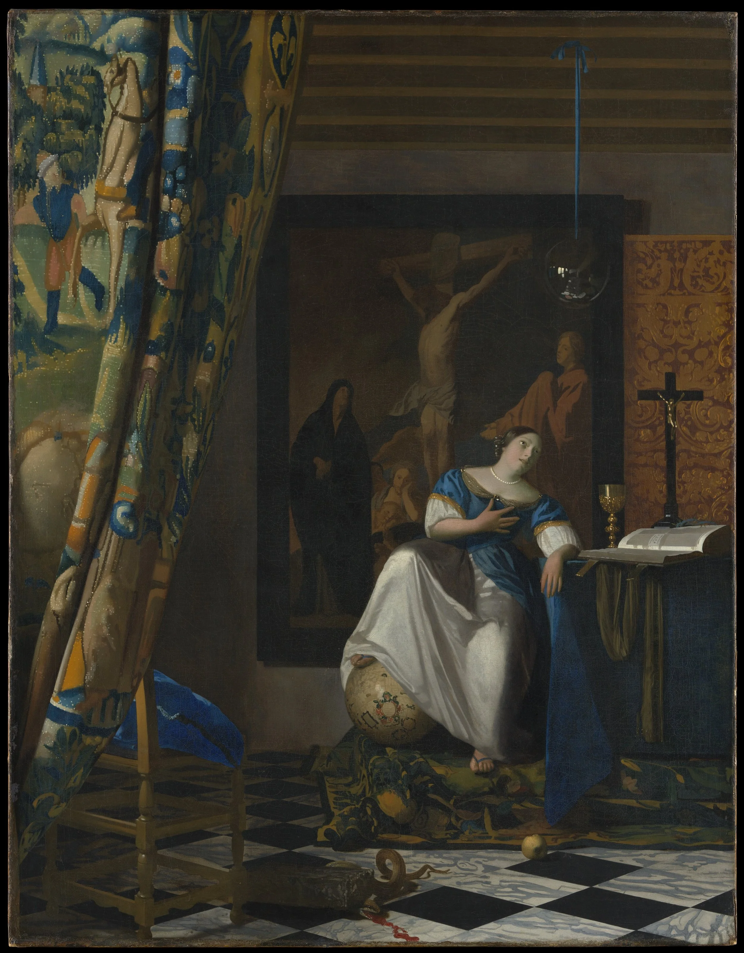
Johannes Vermeer, Allegory of the Catholic Faith, ca. 1670–72. Courtesy of the Metropolitan Museum of Art.
Johannes Vermeer’s Allegory of the Catholic Faith hangs in the European Paintings galleries at The Metropolitan Museum of Art, where the Met displays all five of its Vermeers—more than any other museum in the world. It hangs at the center of the wall, the largest of the five by some margin. A checkerboard marble floor recedes toward a table set with a chalice, a missal, and a crucifix. A tapestry hangs pulled back at the left. A woman representing Faith stands with one foot resting on a terrestrial globe, her eyes cast upward and her hand pressed to her chest. Even the woman herself is mannered rather than observed: her face, neck, and chest have the same smooth, unindividuated finish as porcelain, closer to a mannequin or a statue than a sitter, her pose borrowed from a printed emblem rather than painted from life. A stone crushes a serpent at her feet, a glass sphere hangs behind her, and on the back wall hangs a large, muted painting of the Crucifixion—a copy after Jacob Jordaens that Vermeer’s own household is recorded to have owned.
We spent the past few weeks of the semester studying Alberti and Renaissance pictorial space. Naturally, I first saw the marble floor as a textbook example of black and white tiles receding along orthogonals to a vanishing point. Alberti wrote On Painting as a tribute to Filippo Brunelleschi, who created the first working demonstration of linear perspective. Alberti put that method into words other painters could follow. I expected to find that Vermeer had departed from this tradition, the way artists so often do. Instead, the opposite seems true. Conservators have found a small depression in the paint at this painting’s vanishing point. Vermeer drove a pin into the canvas and snapped a chalked string to rule his orthogonals by hand—a physical, geometric method squarely in the Albertian tradition.¹ Not every scholar agrees this settles the matter. Some point instead to the soft, pooled highlights on the tapestry and metalwork, arguing these are easier to explain as artifacts of a camera obscura lens.² I can’t resolve that argument from where I stand, but the physical hole in the canvas is hard to argue with.
Held against Heinrich Wölfflin’s categories, the floor does not give way to the atmospheric recession typical of the Baroque. The rug, the woman’s foot, and the crushed serpent stay sharp, closer to the mathematical than the painterly. The garments tell a different story. Up close, the drapery is handled loosely, almost roughly, closer to an unfinished study than to Vermeer’s usual tight finish elsewhere. The glass sphere above her head carries its own small, exact record of the room: a reflection of the window that lights it, rendered at a scale smaller than a coin.
I expected to find a rupture in Renaissance perspective, but instead found a pinhole at the center of the world.
¹ For physical evidence of Vermeer’s pin-and-string technique and linear perspective construction in this and other works, see Jørgen Wadum, “Vermeer in Perspective,” in Johannes Vermeer, ed. Arthur K. Wheelock Jr. (Washington, DC: National Gallery of Art; The Hague: Mauritshuis, 1995), 67–79.
² For the competing optical hypothesis, see Philip Steadman, Vermeer’s Camera: Uncovering the Truth Behind the Masterpieces (Oxford: Oxford University Press, 2001). For Wölfflin’s linear/painterly dialectic, see Heinrich Wölfflin, Principles of Art History: The Problem of the Development of Style in Early Modern Art, trans. Jonathan Blower (Los Angeles: Getty Research Institute, 2015), 156–87.
Materiality and the Sensual Body
By Daniela Tellez Palencia
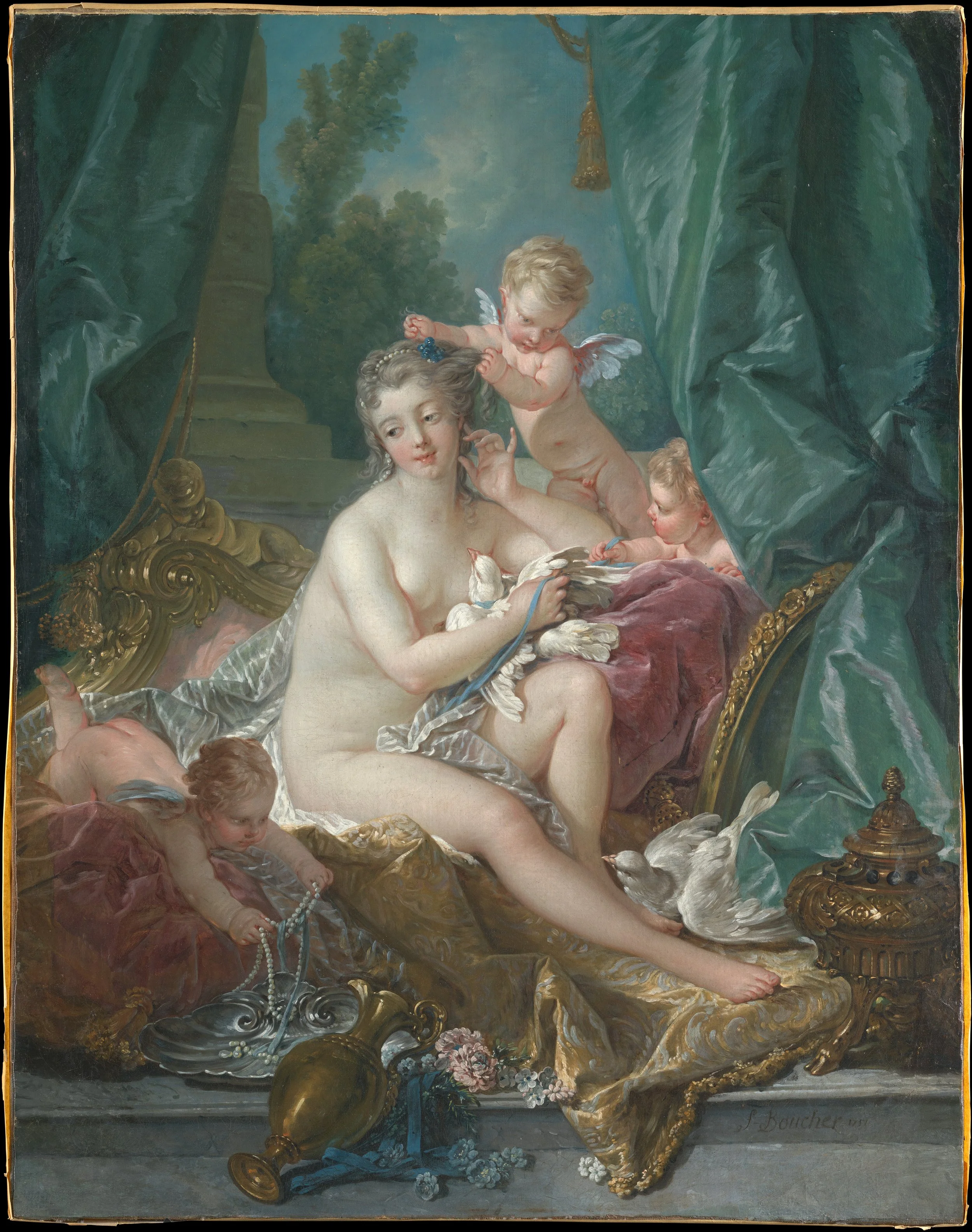
François Boucher, The Toilette of Venus, 1751. Courtesy of the Metropolitan Museum of Art.
While the shimmering, pearlescent flesh in François Boucher’s The Toilette of Venus initially commands attention, the true visual gravitational center quickly shifts toward the luxurious teal green drapery bracketing the scenery. In these folds, Boucher’s brushwork moves beyond mere representation—the fabric becomes a site for gestural marks, as if an allegory for the physical act of painting itself. This fluid, painterly handling sweeps naturally into the background, where the soft rendering of foliage and an architectonic fragment emerge as visual continuations of the heavy silk.
Returning to the foreground, Venus is anchored within a web of tactile encounters: three lively cherubs, two soft doves—one held tightly against her chest—and an opulent display of pearls, golden ornaments, and elaborate furniture. Through this density of surface textures, the canvas collapses the distinction between the physical touch of the loaded brush and the sensory immediacy of skin, feathers, and silk. Venus’s self-aware, reflexive glance ultimately mirrors a broader human reality—a condition where religion, politics, power, and luxury continuously define and shape the psychological life of the body.
From Smear to Porcelain
By Sophia Petra Gaina-Rotaru
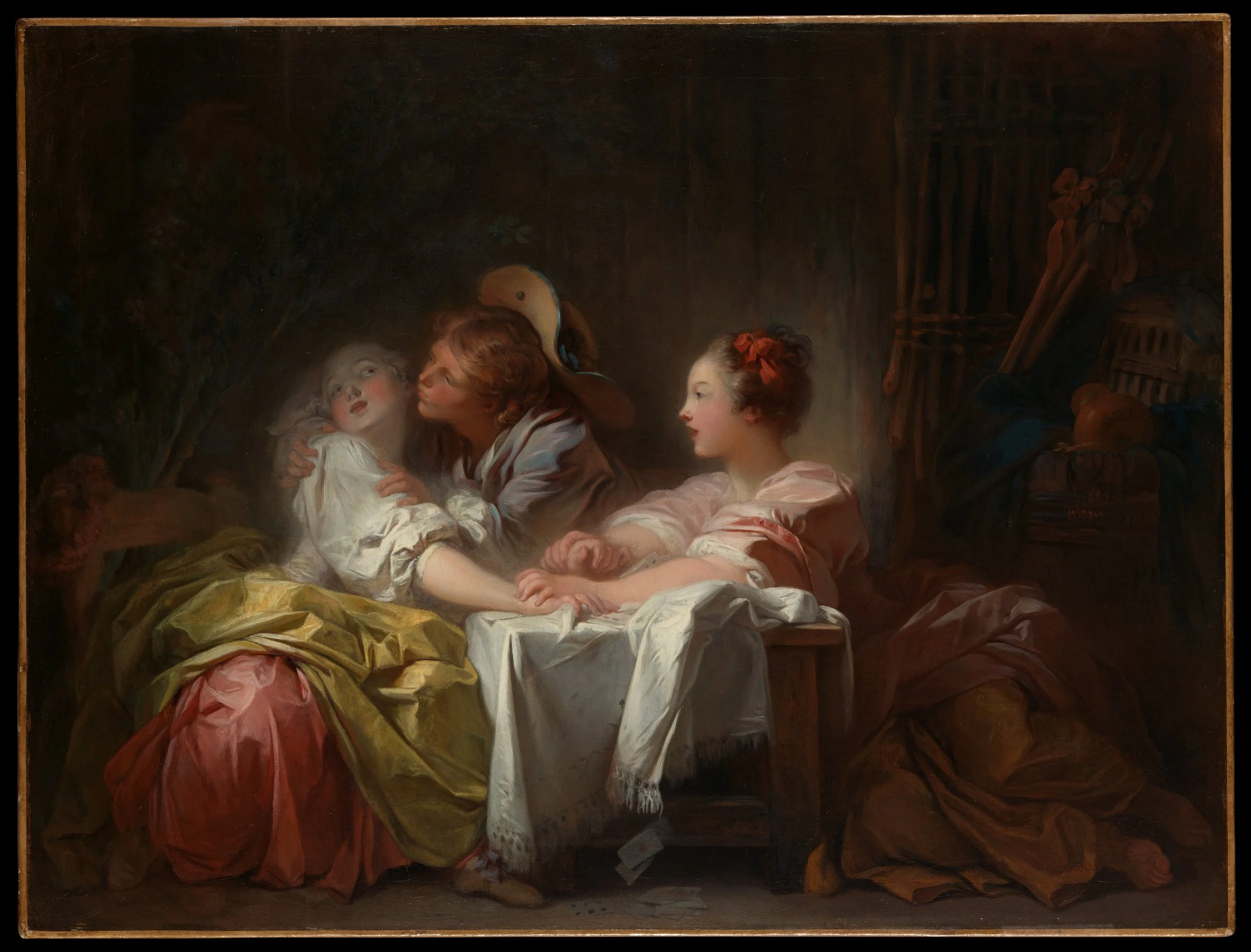
Jean-Honoré Fragonard, The Stolen Kiss, ca. 1760. Courtesy of the Metropolitan Museum of Art.
On a single wall within the Metropolitan Museum of Art's collection of eighteenth-century European paintings, three canvases by Jean-Honoré Fragonard hang side by side, creating a curatorial arrangement that intentionally disrupts a simple chronological narrative. Roman Interior sits poised between a preparatory sketch and a finished work, its oil paint manipulated until the faces turn ghostly, almost like masks. In the adjacent portrait of Marie Emilie Coignet de Courson, the face is precise and fully realized, while the garment and surroundings are handled wildly, featuring dynamic lines cut directly into the wet white ruff. Conversely, The Stolen Kiss is hard-surfaced, mimicking seventeenth-century Dutch genre painting with its delicate faces, freer garments rendered in pink, yellow, and gray, and a dark background that recalls the dramatic atmosphere of the Baroque.
While textbooks frequently position iconic works like The Swing as representative of a uniform Rococo style, this specific wall reveals a painter with a much broader, freer hand—so loose that his brushwork appears to leap across different historical moments. The frantic handling of the Coignet garment could hang seamlessly beside the contemporary canvases of Karen Kilimnik or Elizabeth Peyton, and it even approaches the raw gestural energy of Willem de Kooning’s Women series, save for the highly finished face.
This stylistic plurality is not a flaw in his training, but rather the mark of an academic education that never settled on a single visual grammar. As documented in museum scholarship, Fragonard studied under Jean-Siméon Chardin and François Boucher before completing his residency at the French Academy in Rome, developing a technical range that allowed him to pivot effortlessly between classical rigor and painterly spontaneity. Relying on these archival chronologies, the Metropolitan Museum display positions The Stolen Kiss at the start of his foundational Italian journey and Roman Interior near its conclusion. By framing his later portrait with these two early Italian-period canvases, the curatorial display proves that the very same hand that could meticulously polish a face into porcelain could also choose to release the brush into absolute freedom.
Light, Perspective, Paint
By Sissi Wang
Marie-Denise Villers, Young Woman Drawing (Marie Joséphine Charlotte du Val d’Ognes), 1801. Courtesy of The Metropolitan Museum of Art.
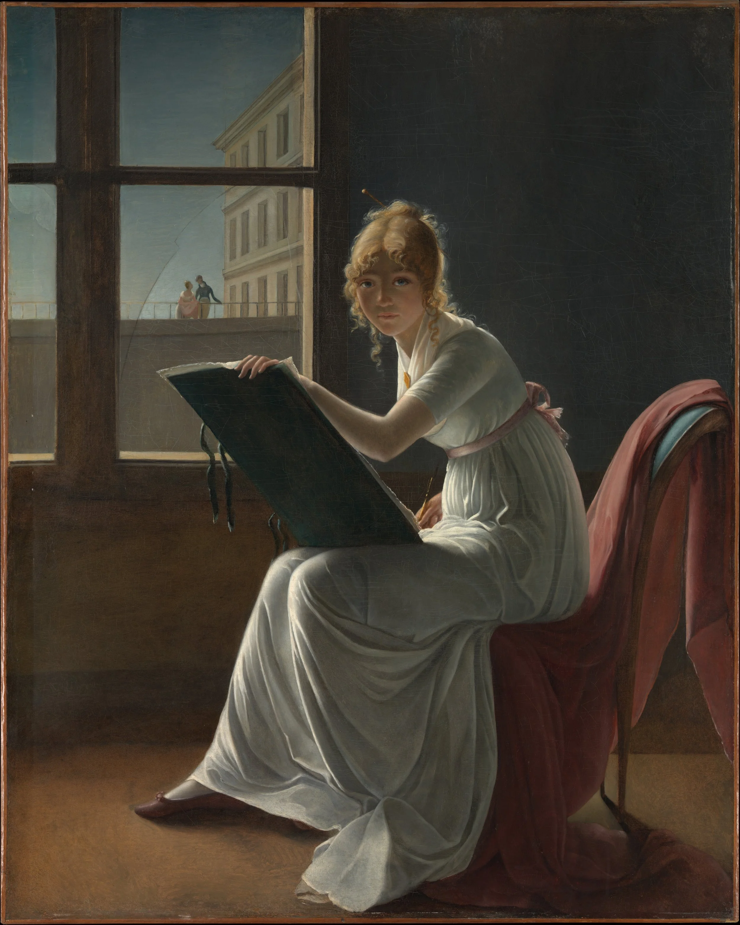
Marie-Denise Villers, Young Woman Drawing (Marie Joséphine Charlotte du Val d’Ognes), 1801. Courtesy of The Metropolitan Museum of Art.
Standing before Marie-Denise Villers’s Young Woman Drawing, I found myself thinking about how a painting reflects on its own creation. Art historians call this self-reflexivity: an artwork becoming a meditation on the act of making art. Because the young woman looks directly out at us while holding a drawing portfolio and stylus, many scholars suggest this canvas functions as a disguised self-portrait. Her posture complicates a simple self-portrait reading: she presents herself not with palette and brush, but as a draughtswoman engaged in the intellectual labor of disegno. To capture her image, Villers would still have needed a mirror directly where we stand. Within this setup, she builds a rigorous grid of architectural perspective that evokes Leon Battista Alberti’s classic idea of the canvas as an open window. Drawing on the Neoclassical traditions of her teacher Anne-Louis Girodet-Trioson and his master Jacques-Louis David, she uses the receding floorboards, the tilt of her portfolio, and the vertical window frame to structure an austere studio space—likely located within the Louvre itself.
Yet this Neoclassical clarity is electrified by Baroque backlighting (contre-jour). Light streams through the window on the left, while the upper right quadrant of the picture surface dissolves into near-total darkness—a near-abstract field of deep shadow that operates like a Caravaggesque void. This stark wall sets off the silhouette of her figure and illuminates the sheet of paper facing the viewer-mirror. Through the broken windowpane—a virtuosic detail of technical skill—a shadowy couple strolls outside, contrasting the public world with the private space of female artistic production. Long misattributed to David, Villers’s canvas took advantage of newly expanded Salon access for women painters in 1801. By locking eyes with us, she uses perspective, light, and academic precision to transform a simple studio study into a landmark meditation on female authorship.
As for that fractured glass, it punctures the ideal of the canvas as a transparent window. A crack is always an abstraction in the center of illusion: a quiet ontological rupture in Neoclassical idealism, rendering the picture plane as transient as time itself. In observing her technical mastery over backlighting and optical reflection, the canvas ultimately enters into dialogue with a future history of images—operating as a painterly precursor to the mechanics of photography.
¹ For the attribution history and the painting's role in feminist art history, see Linda Nochlin, "Why Have There Been No Great Women Artists?" ARTnews 69, no. 9 (January 1971): 22–39, 67–71.