Narrating Forms
Encounters at the Met on Sunday, October 11, 2026
How does an image generate meaning before a single word of text is read? This semester, students of the School of Visual Arts entered the European Paintings galleries at The Metropolitan Museum of Art for Narrating Forms, a project built on one premise: that the formal elements upon a surface are a painting's primary narrator. Moving past the habit of viewing historical paintings as passive illustrations of text, our inquiry treats visual form as an active language through which a painting shapes its own discourse: the intrinsic properties of a line, the illusion of light, the recession beyond the picture surface.
Our analytical foundation is anchored in Jonathan Blower's recent translation of Heinrich Wölfflin's Principles of Art History, published by the Getty Research Institute. In her introductory essay to this critical edition, Evonne Levy reminds us of the book's complex survival, noting that despite decades of methodological shifts, Wölfflin's text remains a permanent baseline because it "engendered debates . . . in the twentieth century for a renewed reading of the text in the twenty-first." Guided by these comparative categories and Laurie Schneider Adams' A History of Western Art, each student composed a written encounter with a single painting, bridging historical context with an active awareness of the phenomenology of vision: that a painter, knowingly or not, negotiates between what is inscribed upon the retina, with its own perspective, and the reality outside the body, where perspective, whether Albertian or Keplerian, does not exist.
The essays gathered here span more than five centuries. The Tuesday group ranges from Maso di Banco's Saint Anthony of Padua to Marie-Denise Villers' portrait of Charlotte du Val d'Ognes, and the Thursday group from Fra Filippo Lippi's Portrait of a Woman with a Man at a Casement to Jean-Léon Gérôme's Prayer in the Mosque.
Gao, Lippi
Martin, Bellini
Jung, Botticelli
Vargas, Titian
Santangelo, El Greco
Harriman, Rubens
Akin, Guercino
Johnson, Vermeer, A Maid Asleep
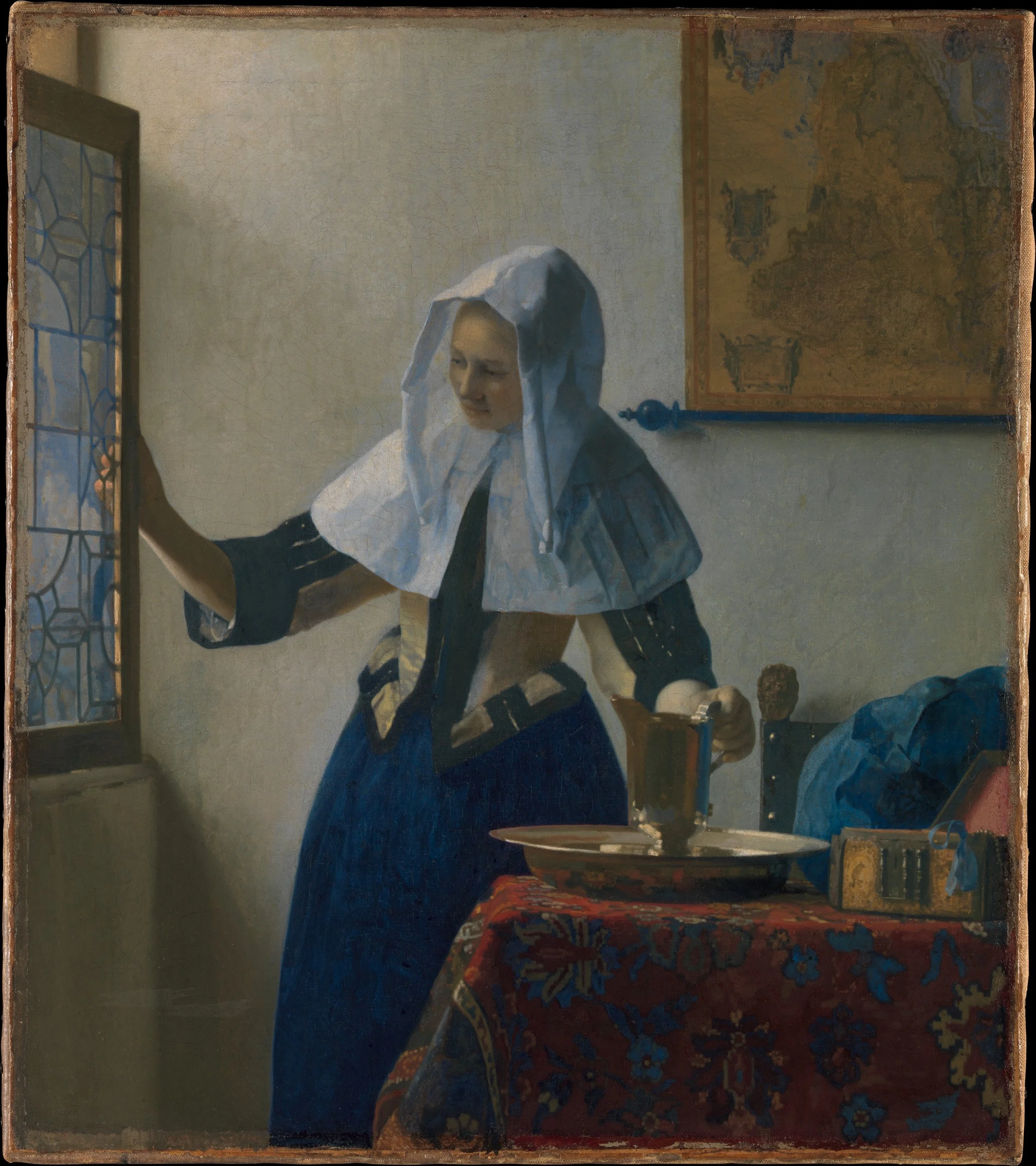
J. Li, Vermeer, Young Woman with a Water Pitcher
Mayesh, Watteau (online)
Lim, Canaletto
Dopp, Boucher
Liu, Fragonard
Mitchell, Prud’hon
Killian, Friedrich
Wong, Ingres
Y. Li, Pasini
Chen, Daisy [selection to be finalized]
Jolene Griffin Michelli [selection to be finalized]
Two Profiles, Two Windows
By Zhenying Gao
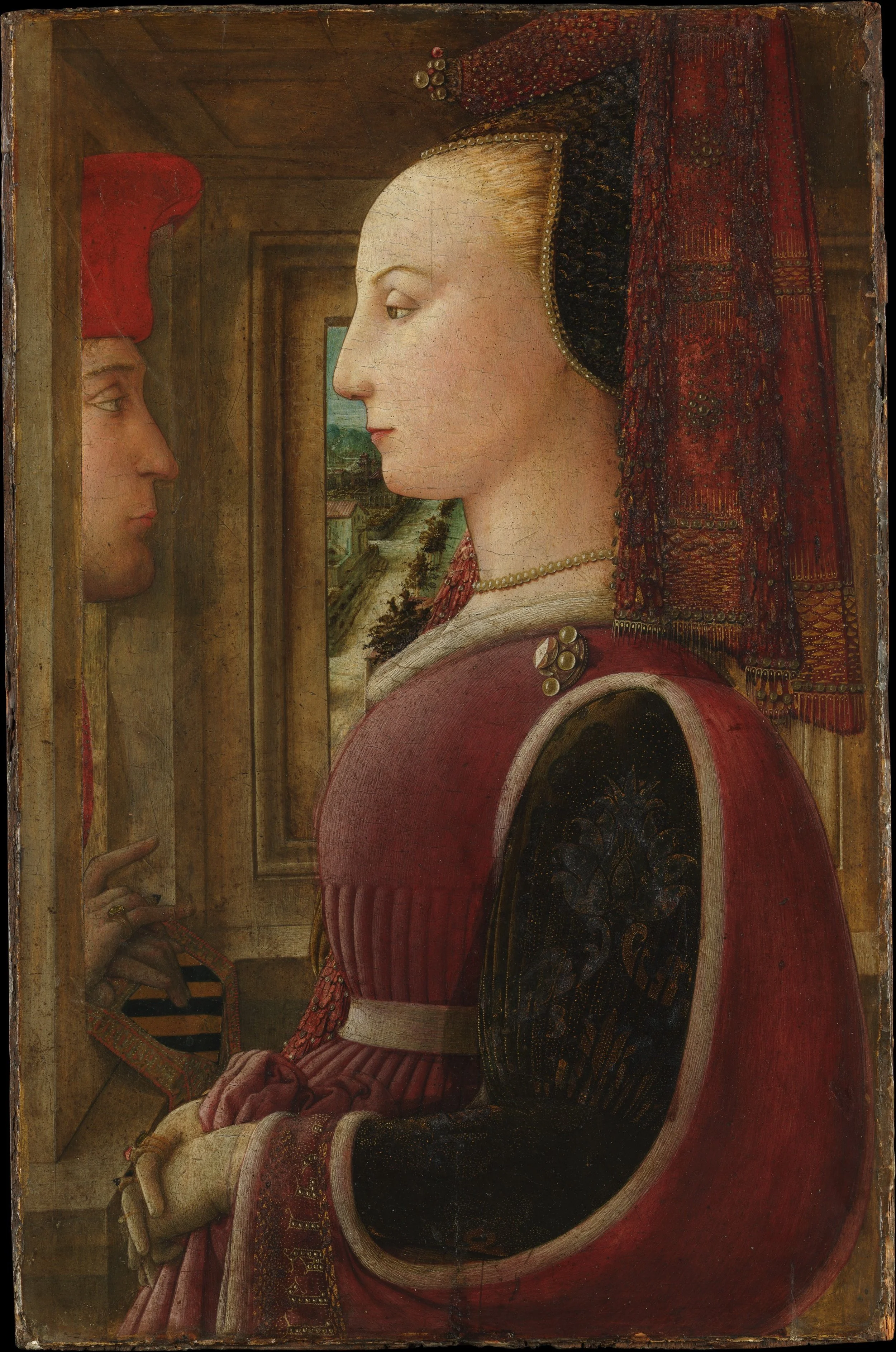
Fra Filippo Lippi, Portrait of a Woman with a Man at a Casement, ca. 1440. Courtesy of the Metropolitan Museum of Art.
At The Metropolitan Museum of Art, a wall text titled “Faces of the Renaissance” explains that painted portraits of individuals multiplied around 1450, when merchants and bankers began commissioning images that would commemorate them and record their status for posterity. The room largely confirms this account. Hugo van der Goes’ Portrait of a Man, Antonello da Messina’s Portrait of a Young Man, and Hans Memling’s portraits of Tommaso and Maria Portinari each present a single sitter within a single frame, and even the Portinari, a married couple, are divided into two separate panels. Only two paintings place two people in the same picture: Domenico Ghirlandaio’s Francesco Sassetti and His Son Teodoro and Fra Filippo Lippi’s Portrait of a Woman with a Man at a Casement. These double portraits commemorate a family rather than a self, and in doing so they raise a question the wall text does not ask, whether a portrait can also tell a story.
Lippi’s painting, the earliest surviving double portrait in Italian art, suggests that it can. A young woman in fashionable French-style dress, her fingers crowded with rings, appears in profile inside a room, while a man peers in through a casement at the left, his hands resting on a coat of arms. On her ermine-lined sleeve, the word lealtà, meaning loyalty, is stitched in gold thread and seed pearls, and the museum reads these signs as a betrothal, with the man as her likely future husband. Yet the two never meet each other’s eyes. The strict profile, the convention of the time, makes an exchange of glances impossible, and a woman of her class was expected to be seen rather than to look, so the story is carried by emblems rather than by faces.
Behind her, a window opens onto a distant landscape, yet her profile, drawn with a crisp linear contour, cuts across the view, so that the sitter herself stands between us and the world outside. On the same wall, Lorenzo di Credi’s Portrait of a Young Woman, painted some fifty years later, brings nature closer. A juniper bush grows behind the sitter, and because the old Italian word ginevro echoes the name inscribed on the back of the panel, Ginevra, the plant becomes an emblem of the person herself. She no longer sits in profile but turns toward us with her hands visible, a shift that, as the museum’s label notes, gives a greater sense of her inner psychology.
Credi looked back to Leonardo da Vinci’s Ginevra de’ Benci, painted around 1474–78 and now in the National Gallery of Art in Washington, where a juniper likewise surrounds the sitter’s face. In Leonardo’s portrait the face itself, calm and withdrawn, seems to hold thoughts we are not allowed to read, and its gentle modeling in light and shadow loosens the linear outline that fixes Lippi’s woman against her window. The room asks whether a portrait can tell a story, and Lippi answers through his emblems, while Leonardo begins to answer through a face.
Body and Nature in Bellini
By Val Martin
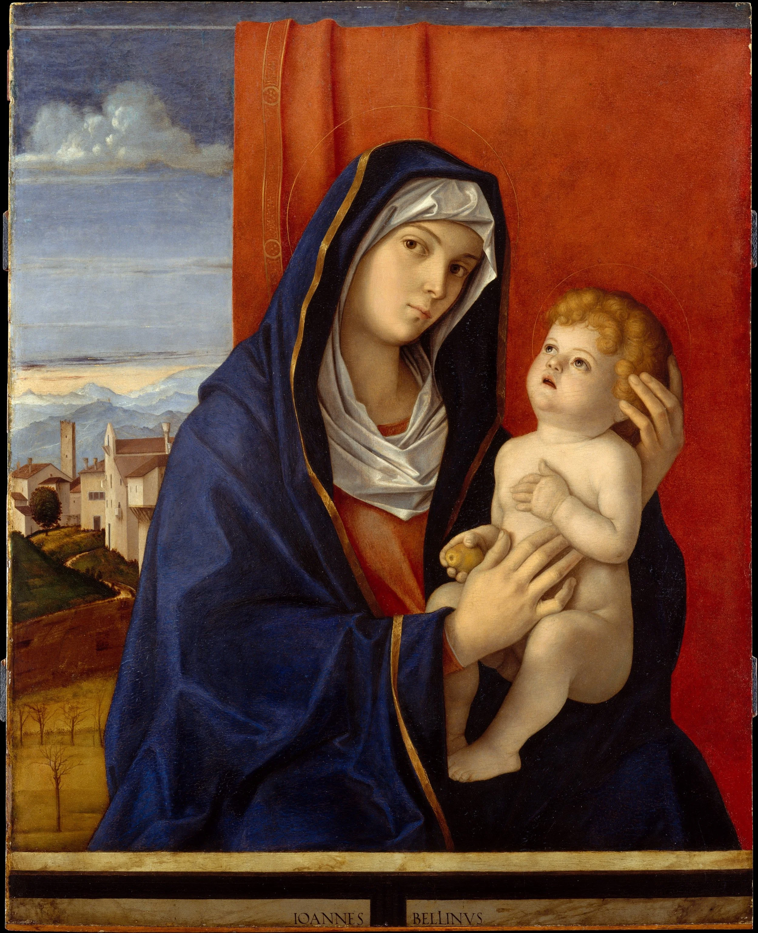
Giovanni Bellini, Madonna and Child, late 1480s. Courtesy of the Metropolitan Museum of Art.
As I looked at Giovanni Bellini’s Madonna and Child, painted in the late 1480s, at The Metropolitan Museum of Art, a painted stone parapet seemed to keep me out of her world. Yet her gaze kept drawing me back in. Behind her, a cloth of honor, the rich textile traditionally hung behind an enthroned sacred figure, has been drawn aside to reveal a landscape in transition, bare branches giving way to green. The Met’s own catalogue entry reads this, along with the pale dawn sky above it, as a quiet metaphor for death and rebirth, a theme carried by the setting as much as by the figures themselves.¹ In her hand the Virgin holds a small fruit, a traditional sign of redemption that fits this reading.
Giotto, in the early fourteenth century, first gave painted bodies this kind of weight, modeling them with soft shifts of light instead of outline. Bellini does the same for the Christ Child: his small body has mass, resting its weight in his mother’s hands the way an actual infant would, not pasted flat against the picture plane.
As for space, the painting resists the geometric clarity of the Albertian model. There is no tiled floor, no architecture built from converging orthogonals. Yet a small town does appear in the distant landscape: a tower, a cluster of houses, a road winding up the hillside. Its architecture is handled through an intuitive perspective rather than Alberti’s mathematical construction, and it recedes through what Leonardo would later call aerial perspective, shrinking and softening into haze. A single white cloud sits above the architecture of the town, in the pale sky. Drawing in part on the methodology of semiology, the French art historian Hubert Damisch has written about this opposition of architecture and sky. Revisiting Brunelleschi’s experiment, he treats the undefinable cloud as the counterpart to definable architecture.² This small, drifting shape may be doing that work here, standing outside the model the rest of the view only gestures toward. Depth here is built in layers instead: the stone parapet closest to us, the two figures just behind it, the cloth of honor pulled back like a curtain, and finally that landscape opening into distance. It is a spatial construction closer to staged, atmospheric depth than rigorous linear perspective.
Light in this painting never collapses into the dramatic voids of tenebrism. Bellini’s light is even and atmospheric, the Venetian daylight that would come to define the city’s painting for the next century. Nothing here dissolves into darkness, and everything stays visible, legible, held in a single soft illumination.
In Wölfflin’s terms, the painting remains linear, since every form, from the gold border of the blue mantle to the child’s body against the red cloth, is held by a clear contour. Yet Bellini’s line is softer than that of Florentine painting, and the flesh of mother and child is modeled in gradual transitions of light. The Met’s own catalogue entry connects Bellini’s handling directly to Titian, who trained in Bellini’s workshop and would later loosen it into a fully painterly manner. When Albrecht Dürer met Bellini in Venice, the German painter, trained in a harder, more linear tradition, called him, even in his seventies, “still the best in the art of painting.”³ Standing here, in front of this Madonna, it is not hard to see why Dürer said so.
Notes
¹ The Metropolitan Museum of Art, catalogue entry for Giovanni Bellini, Madonna and Child, late 1480s.
² Hubert Damisch, A Theory of /Cloud/: Toward a History of Painting, trans. Janet Lloyd (Stanford, CA: Stanford University Press, 2002), 120–24.
³ The Metropolitan Museum of Art, catalogue entry for Bellini, Madonna and Child.
Annunciation as Allegory
By Yeonwoo Jung
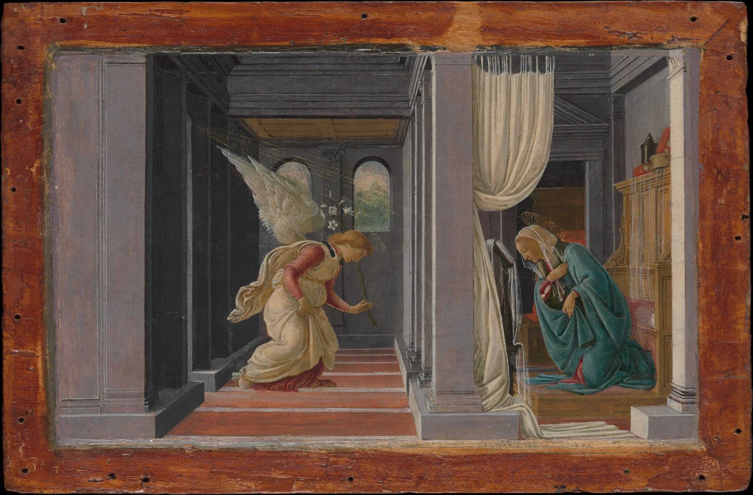
Sandro Botticelli, The Annunciation, ca. 1490. Courtesy of the Metropolitan Museum of Art.
The Annunciation by Sandro Botticelli encourages viewers to reflect on the holy moment when the Angel Gabriel tells the Virgin Mary that she will give birth to Jesus. The painting connects medieval religious art with early Renaissance humanism. In medieval art, the Virgin Mary was often presented as a rigid, distant queen. The Renaissance, however, shifted the focus by introducing humanism and individual experience. Botticelli departs from the older, rigid type by portraying Mary with human feeling, capturing her humble and graceful gesture toward the angel. As the work highlights the calm beauty of both figures, it reflects Early Renaissance traditions through clear contours and systematically constructed architectural space. The modeling and chiaroscuro show gradual changes in value that shape the contours of Gabriel's pale robes and the blue-green mantle worn by Mary. The light and shadow imply the presence of bodies under the cloth, giving volume and weight to the otherwise two-dimensional surface. Yet thin proportions and graceful lines highlight their elegance, the "linear quality" that Laurie Schneider Adams finds "characteristic of Botticelli's distinctive style."¹
Receding floor edges, ceiling moldings, and orthogonal lines draw the eye into the interior, crossing over the horizontal floor divisions. At the same time, repeated columns divide the architecture into distinct sections, highlighting the vanishing point and the horizon line. The perspective arranges the position of the viewer and establishes depth, implying the horizon line within the system rather than depicting it as a continuous line. The same perspective also separates the two figures: a broad pier stands between Gabriel and Mary, so that the architecture both joins them in one ordered space and keeps the messenger apart from the Virgin's private room. Unlike Caravaggio's tenebrism, which uses darkness to erase the background into an empty void, Botticelli's shadows allow the viewer to see columns, furniture, and rooms. Here the darkness reveals architectural depth rather than erasing the background.
The figures, drapery, wings, and architectural edges have distinct contours. The painting is mostly linear, and its forms are distinguishable on their own, while flowing lines give grace to the figures. Gabriel and Mary are arranged across the foreground, while the architecture extends behind them, in a composition structured around both plane and recession. The lateral organization makes the scene easy to follow, and the receding architecture gives it depth. Although the figures, columns, overhead architectural elements, and overall structure enclose the scene with a mix of closed and open forms, the closed form remains dominant. For Wölfflin, a closed composition uses structural, "tectonic" devices, such as firm verticals and horizontals, so that the picture seems "bounded within itself," while open form "suggests something beyond itself."² In Botticelli's panel, the columns, moldings, and edges of the rooms do exactly this work. The architectural structure holds attention, stability, and containment in the meeting.
A formalist method centers on contours, values, colors, proportions, space, and gestures. Through a formalist lens, we can see that it is the painting's composition, rather than its narrative subject alone, that establishes the orderly and respectful tone of the Annunciation. The form and content of Gabriel's announcement to Mary include architecture, color, line, and bodily posture, and meaning is created by their interaction: bowed heads and bodies angled downward express humility, while the ordered architecture gives the sacred event a meaningful setting. In the terms of a historiographic schema, linear contours and clarity here coexist with recession and compositional unity. The painting is not confined to one side of all of Wölfflin's dichotomies. As Evonne Levy observes, although many art historians have long questioned Wölfflin's book, it "remains part of the discussion."³ Classification systems based on history serve to structure stylistic distinctions, but they do not completely define a particular work of art.
Following the orthogonals of the floor and ceiling in Gabriel's hall, my eye arrives at the back wall, where two arched windows open onto trees and pale sky. Through them, the painting moves through three degrees of measure: the architecture, fully defined by perspective; the trees, whose trunks stand like small columns while their foliage loses its outline; and the sky, which no line can measure. Could the Annunciation also be read as an allegory of perspective itself, the system Brunelleschi demonstrated and Alberti theorized, reaching at its vanishing point what it cannot contain? If so, the painting holds two forms of knowledge at once, one built on measurement and the other on the Word that, in the Gospel of John, "was made flesh," and it asks to be seen through both.⁴
Notes
¹ Laurie Schneider Adams, A History of Western Art, rev. 4th ed. (New York: McGraw-Hill, 2008), 264.
² Heinrich Wölfflin, Principles of Art History: The Problem of the Development of Style in Early Modern Art, trans. Jonathan Blower (Los Angeles: Getty Research Institute, 2015), 204–5.
³ Evonne Levy, "Wölfflin's Principles of Art History (1915–2015): A Prolegomenon for Its Second Century," introduction to Wölfflin, Principles of Art History, 35.
⁴ John 1:14 (King James Version).
Twofold Visuality in Titian
By Yaretzi Vargas
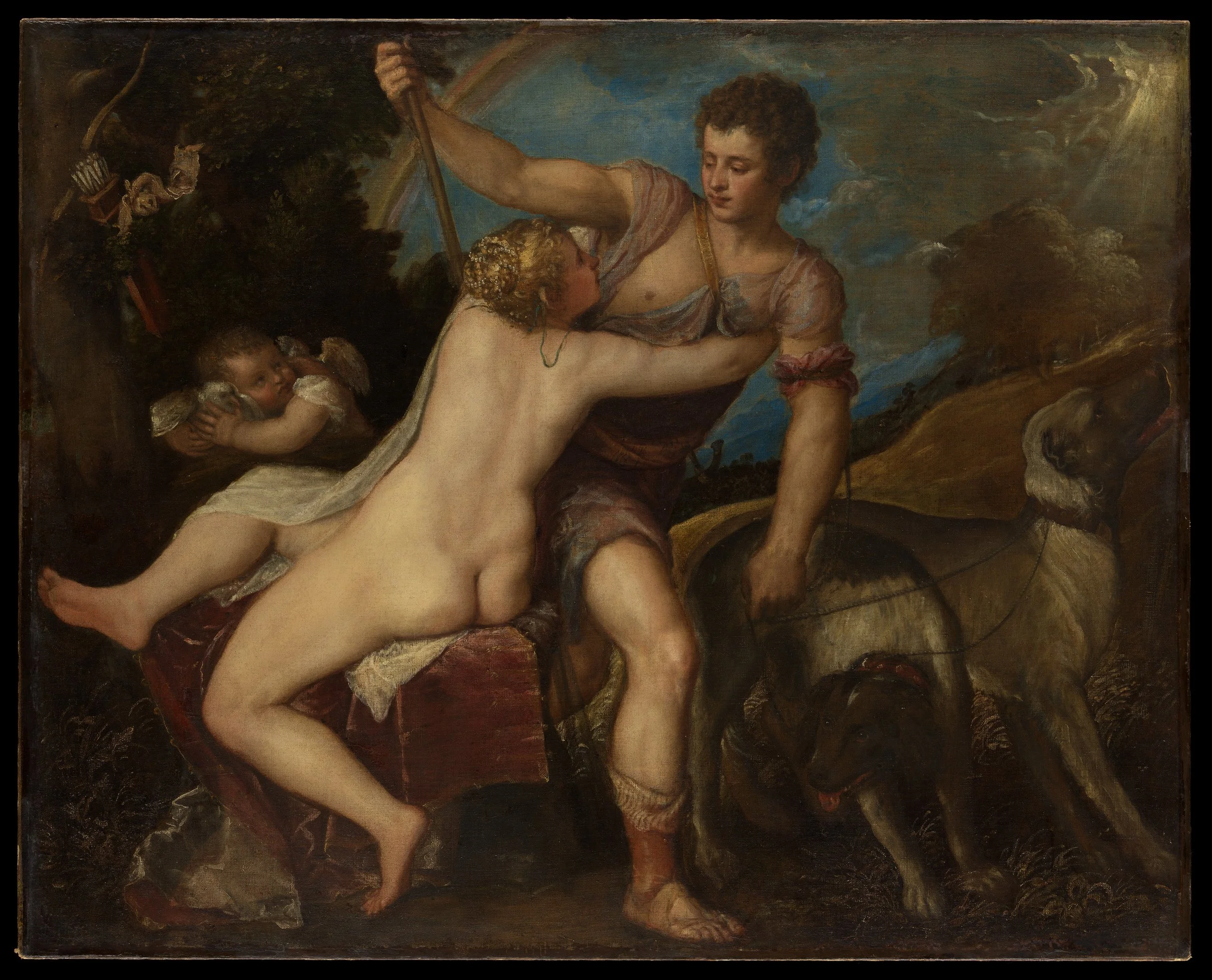
Titian, Venus and Adonis, 1550s. Courtesy of the Metropolitan Museum of Art.
In Titian's Venus and Adonis, painted in the 1550s, Venus holds back Adonis as he leaves with his spear and hounds for the hunt in which he will die. The painting sets two ways of seeing against each other. The figures in the foreground are modeled with clarity, while the landscape behind them dissolves into loose strokes. This dialectic between foreground and background places the painting between the linear style of Titian's early career and the painterly freedom of his last works.
Venus is seen from behind, seated on a block draped in red velvet. Her legs extend to the left while her torso twists to the right, and her arms reach around Adonis. Her back is the most luminous passage in the painting, modeled in warm gradations of light rather than by outline. Adonis strides to the right, his raised arm holding the spear, and the two bodies meet only through her embrace and their exchanged glance. At the left, Cupid clutches a dove, and his bow and quiver hang unused in the tree.
Two other paintings by Titian frame this one. The Venus of Urbino (1538) presents a frontal body defined by a continuous contour within an ordered interior. The Rape of Europa (1560–62) dissolves figures, sea, and sky in open brushwork. The Met's canvas stands between them. Its figures keep the clarity of the earlier work, while its landscape, the hill at the right and the light breaking through the clouds, already belongs to the later manner. In Wölfflin's terms, the painting holds two moments at once. Writing of the sixteenth century, he observes:
as soon as art has completely conquered foreshortening and the deep pictorial stage we suddenly see it consciously and consequentially espousing the plane as the only proper form of perception; a form of perception that, though it may be abrogated here and there by the occasional recessive motif, nevertheless permeates the whole as the basic binding form.¹
Venus and Adonis stretch across the foreground in a single stratum, close to the edge of the picture. The hill at the right is the recessive motif, leading the eye back toward the distant mountains, where the seventeenth century's interest in depth already begins.
In this passage, Wölfflin defines perception on a differential basis, as a form of seeing that distinguishes one period from another. Maurice Merleau-Ponty describes it as each viewer lives it: "I apply my gaze to a fragment of the landscape, which becomes animated and displayed, while the other objects recede into the margins and become dormant, but they do not cease to be there."² The eye holds the bodies of Venus and Adonis in focus, while the landscape remains a field around them.³ Foreground and background depend on each other.
Adonis is already turning toward the part of the painting that will not come into focus. The hunt that awaits him lies in the loosely painted hills at the right, where form gives way to light and color. Titian lets the tragedy unfold in the passage from foreground to background, from the clarity of the embrace to the uncertain world into which Adonis departs.
Notes
¹ Heinrich Wölfflin, Principles of Art History: The Problem of the Development of Style in Early Modern Art, trans. Jonathan Blower (Los Angeles: Getty Research Institute, 2015), 156.
² Maurice Merleau-Ponty, Phenomenology of Perception, trans. Donald A. Landes (London: Routledge, 2012), 70.
³ The contrast between firmly modeled figures and a softened distance has a long history in Italian painting, from the mountains behind the apostles in Masaccio's Tribute Money (ca. 1425) to the hazy harbor and mountains in Leonardo's Annunciation (ca. 1472–76). In those works the distance fades through tone and color, while in Titian's Venus and Adonis it is also painted in looser strokes.
El Greco’s Painterly Language
By Thomas Santangelo
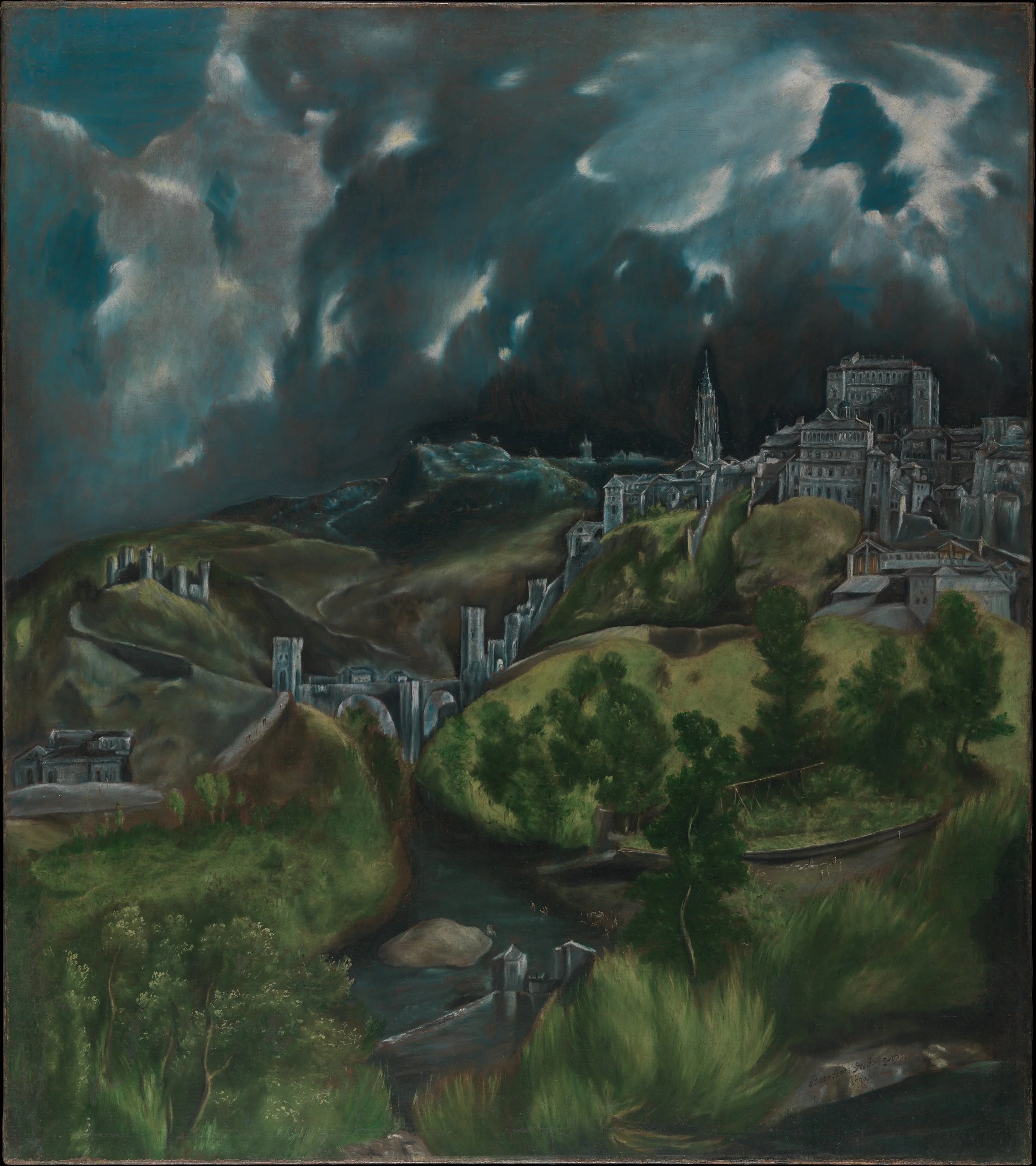
El Greco, View of Toledo, ca. 1599–1600. Courtesy of the Metropolitan Museum of Art.
Among El Greco’s paintings at The Metropolitan Museum of Art, View of Toledo (ca. 1599–1600) was not on view. But another of his works in the gallery, The Vision of Saint John, has the same swirling, cloud-like brushwork. Looking at it, I could still picture the missing landscape. Using Wölfflin’s formalist categories, which oppose the classic sixteenth century to the Baroque seventeenth, I would classify that turbulent sky and shifting ground as painterly, open in form, and relatively unclear, qualities his scheme assigns to the Baroque, even though View of Toledo was painted around 1600.¹
Chronologically, however, El Greco belongs to the sixteenth century, and survey books tend to place him among the Mannerists rather than the Baroque painters. Yet he is an unusual Mannerist, one whose kinship with the style lies in stylization, in elongated forms and distorted space, rather than in the hard, polished contours of Pontormo, Parmigianino, and Bronzino. As Laurie Schneider Adams writes of his late work, “Mannerism has been placed squarely in the service of Christian mysticism.”² El Greco drew on his early training in Byzantine icon painting to reject naturalism for an otherworldly vision. He spent time in Titian’s workshop in Venice and knew Renaissance geometry well.³ Working later in Counter-Reformation Spain, far from the painting centers of Rome and Venice, he chose to break from that geometry rather than follow it. His brushwork turns loose, melting the hills into a restless sky, and the composition pulls the eye up the steep slope of the Tagus valley toward the city. Storm clouds roll past the edges of the canvas, ignoring any closed, stable frame. The flickering light does not describe real weather but unifies the whole scene into one pulsing mood, more important than any single detail.
Today, the painting feels strangely modern. Its sweeping emotion already anticipates Delacroix, and in its shifting atmosphere Monet is close by. The sky’s raw intensity recalls Van Gogh, while the painting’s “faceted effect,” in the words of the Met’s label, looks forward to Cézanne.⁴ El Greco broke the classical rules of his own time, and in doing so he built a direct visual language that speaks to a modern eye. Perhaps the painting’s power lies in El Greco’s gestural handling of greens and blues, two cool, neighboring hues that Cézanne would later modulate to open new space for a painterly abstraction that aims to mirror both vision and visuality.
Notes
¹ Heinrich Wölfflin, Principles of Art History: The Problem of the Development of Style in Early Modern Art, trans. Jonathan Blower (Los Angeles: Getty Research Institute, 2015), 96–97.
² Laurie Schneider Adams, A History of Western Art, rev. 4th ed. (New York: McGraw-Hill, 2008), 314. For further study, see Max Dvořák, “El Greco and Mannerism,” in The History of Art as the History of Ideas, trans. John Hardy (London: Routledge & Kegan Paul, 1984).
³ Adams, 314. El Greco was born in Crete, then a possession of Venice, and moved to Venice around 1567. The main contemporary evidence for his time with Titian is a letter of 1570 by the miniaturist Giulio Clovio, who called him a “disciple” of Titian, which may or may not mean that he worked in Titian’s workshop.
⁴ The Metropolitan Museum of Art, label for El Greco, View of Toledo, ca. 1599–1600.
Rubens: Clarity and Motion
By Rowan Harriman (to be finalized through Claude)
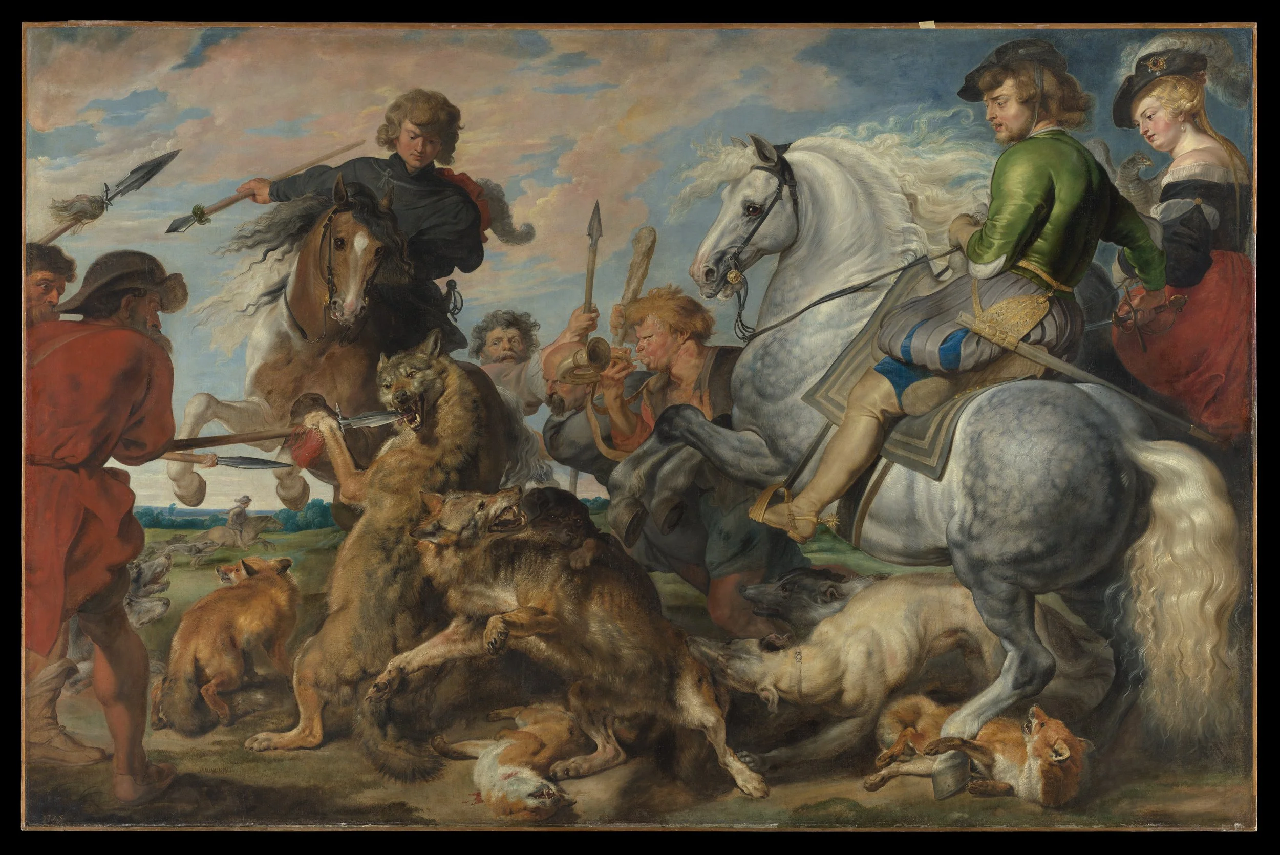
Peter Paul Rubens, Wolf and Fox Hunt, ca. 1616. Courtesy of the Metropolitan Museum of Art.
Standing before the Flemish painter Peter Paul Rubens’ Wolf and Fox Hunt, I felt as if I were in nature, participating in a historical drama of fear and brutality. The canvas’s eight-foot scale makes the scene physical, a human effort long absent from city life. The paint handling reveals a real tension. Rubens models the fighting wolves and dogs with taut, almost sculptural precision, and their fur and muscle look true to life, almost like verism itself. The white horse’s mane, by contrast, moves in loose, sweeping strokes, and the sky is streaked in pink and blue above the chaos. A brown horse rears beneath a rider in black, while a hunter in red, on foot, drives his spear at a wolf. Nearby, a rider in green sits calm on the white horse.
The weight of these bodies has a history. Giotto first gave bodies real mass and real space to move through, instead of the flat, frontal stillness of icon painting, and three centuries later Rubens inherits that lineage, giving it his own fluid cast. The sharp, localized shadows show his interest in Caravaggio’s chiaroscuro, while his rapid brushwork expands on Titian, whose loose handling Rubens studied and copied throughout his career.¹ Yet he never adopts the rough finish of Titian’s late works, such as The Rape of Europa, a painting he would later copy himself. Even at its loosest, his brushwork in the wolves still describes each tuft of fur. Depth comes not from ruled lines or a measured vanishing point, but from overlapping bodies, receding hills, and the placement of hounds, horses, and hunters in space. Still, the painting works like a window, even without Albertian perspective to build it.
Rubens’ handling is not simply the painterly style Wölfflin described. The wolves and dogs play both modes at once, near or far: each body is bounded by a firm contour, like Giotto’s figures, yet its fur is laid in with quick, flickering strokes. According to the Met’s label, Rubens painted the canvas with the help of assistants but claimed the wolves as his own work.² The horse’s mane and the sky turn fully loose and painterly, and Rubens holds both at once. None of this needed architecture to hold it together, though architecture had ruled Italian Renaissance painting for centuries, from Masaccio to Raphael, imposing a sense of the stationary. Like Titian and Caravaggio, Rubens drops that stillness, and his canvas moves like a scene caught on film, staged and theatrical. Maybe the hunt is what nature once asked of us, before the city traded it for a TV screen.
Notes
¹ Heinrich Wölfflin, Principles of Art History: The Problem of the Development of Style in Early Modern Art, trans. Jonathan Blower (Los Angeles: Getty Research Institute, 2015), 92. Wölfflin writes that Rubens’ “style is heavily dependent on one cultural tendency in particular, on the sensibility of the southern baroque.”
² The Metropolitan Museum of Art, label for Peter Paul Rubens, Wolf and Fox Hunt, ca. 1616.
Guercino’s Samson: A Body Without a Face
By Zeynep Akin (to be finalized through Claude)
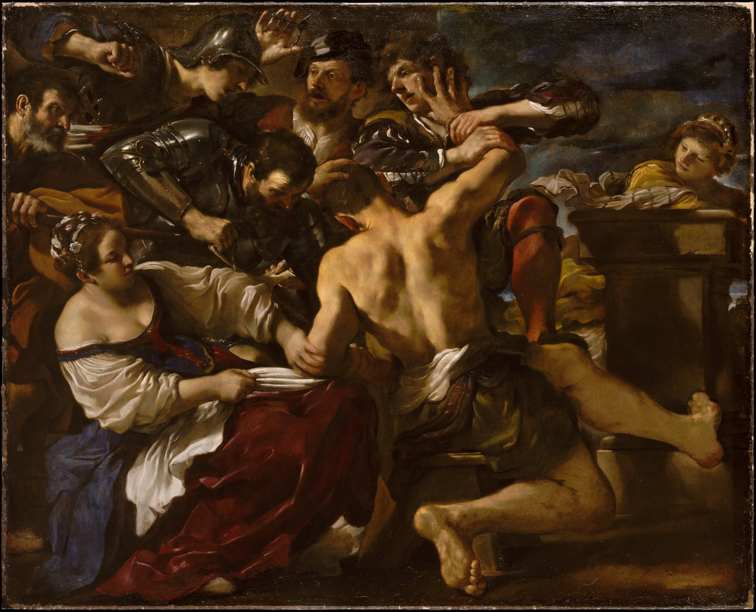
Guercino, Samson Captured by the Philistines, 1619. Courtesy of the Metropolitan Museum of Art
In Gallery 620 of The Metropolitan Museum of Art, Guercino’s Samson Captured by the Philistines presents its hero in a way I did not expect. Samson’s face, where I would normally look for his anguish, is turned away from me and pressed downward by a hand on his head, while his bare, muscular back fills the center of the canvas. Around him the Philistines close in, one raising a pair of shears above the crowd and another lowering a blade toward him, as Delilah sits at the lower left pulling at a white cloth and watching with an unsettling calm. Every other face in the painting shows alarm, effort, or curiosity, yet the one face that should carry the drama is withheld, so whatever Samson feels must reach me through his body alone.
Heinrich Wölfflin’s categories help explain how this works. The figures are packed so tightly that arms, armor, and torsos merge into a single struggling mass, an instance of what Wölfflin calls unity, in which no part can be detached from the whole.¹ The tangle is also unclear, since at moments I cannot tell whose hand belongs to whom, and while light falls on Samson’s back and Delilah’s sleeves, the edges of the surrounding forms sink into shadow, giving the surface a painterly rather than linear character. In this way the confusion of forms becomes the confusion of the struggle itself.
The darkness does more than set a mood. Large areas of the canvas dissolve into brown and black, and against the stormy sky at the upper right the figures lose their contours, approaching a kind of abstraction in which paint and shadow matter as much as the bodies they describe. This play of light and dark recalls the tenebrism of Caravaggio, whose paintings hang in the same gallery. Nor does Guercino build his scene on the perspectival architecture that Leon Battista Alberti prescribed for measuring depth. Apart from a bare stone block at the right, over which a woman peers at the struggle, there is no receding floor or wall and no vanishing point, so depth is made from bodies emerging out of darkness.
Facing these life-size figures, I become aware of my own seeing. The painting shows the moment just before a man loses his sight, and it places me behind him, close enough to share his position but unable to see what he sees. His helplessness comes through in the strain of his shoulders, the outstretched leg, and the hand forcing his head down, not through an expression. The psychological drama does not disappear; it moves from the face into the form, and the narrative becomes something I experience physically rather than simply read.
Note
¹ Heinrich Wölfflin, Principles of Art History: The Problem of the Development of Style in Early Modern Art, trans. Jonathan Blower (Los Angeles: Getty Research Institute, 2015).
Vermeer: From the Doorway to the Eye
By Keagan Johnson (to be finalized through Claude)
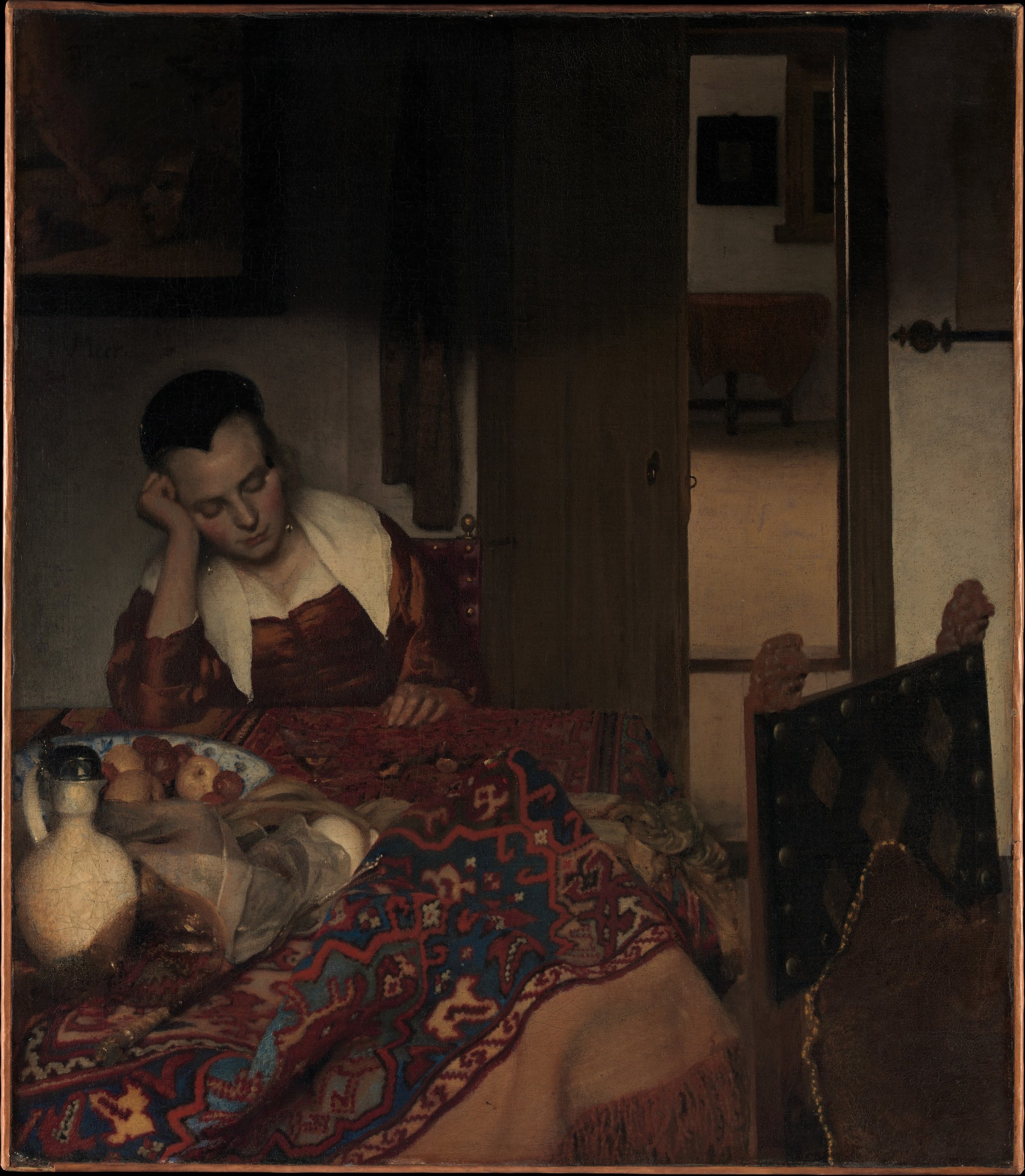
Johannes Vermeer, A Maid Asleep, ca. 1656–57. Courtesy of the Metropolitan Museum of Art.
A young woman sits at a table with her eyes closed, her head resting on her hand. In front of her, a heavy carpet is pushed into folds beside a white jug, a blue-and-white bowl of fruit, and a glass. Behind her, a door stands half open onto a second, brighter room, and on the wall above her, half lost in shadow, hangs a painting of which only a fragment can be read. Vermeer renders the carpet, the fruit, and the woman’s face in soft, painterly touches, while firmer lines still hold the edges of the door, the frame, and the chair.¹ The painting draws me in through these carefully described objects and then holds me back, since the one person in the room is closed to me in sleep.
The more I look, the more the room seems to point to someone who is no longer there. The rumpled carpet and the toppled glass hint, as the museum’s label suggests, at a visitor who has just left, and in the shadowed picture above her, barely visible, a Cupid stands beside a mask, an emblem of love and deceit. Dutch painters often showed unsupervised maids neglecting their duties, and the scene invites that moral reading. Yet Vermeer leaves every clue unresolved, so that a lesson about negligence becomes a mystery.
Her pose recalls a much older image of a mind withdrawn into itself, Albrecht Dürer’s engraving Melencolia I of 1514. Dürer’s winged figure also rests her head on her hand, surrounded by the tools of geometry and craft that she no longer uses, as if inspiration itself had failed. Laurie Schneider Adams suggests that the “female winged genius” stands for Dürer himself, “an idle, uninspired creator ... looking inward for inspiration and not finding it.”² More than a century after the Protestant Reformation, Vermeer gives the same gesture to a servant in an ordinary household, with no allegory to explain her.
The winged figure of Dürer’s Melencolia I is wide awake, while Vermeer’s maid has closed her eyes. In another of Dürer’s prints, a draftsman fixes his eye at a small sight and measures his model through a gridded screen, building the picture from a single point. In Vermeer’s room, the only figure has stopped looking, and light alone settles on the jug, the fruit, and the folds of the carpet, offered to my eye rather than measured by it.³ The story stays unfinished, and what the painting holds instead is a moment given to us through light and surface.
Notes
¹ See Heinrich Wölfflin, Principles of Art History: The Problem of the Development of Style in Early Modern Art, trans. Jonathan Blower (Los Angeles: Getty Research Institute, 2015).
² Laurie Schneider Adams, A History of Western Art, 5th ed. (New York: McGraw Hill, 2011), 327.
³ Svetlana Alpers, The Art of Describing: Dutch Art in the Seventeenth Century (Chicago: University of Chicago Press, 1983), 42, where she writes that “we can let Dürer’s rendering of a draftsman at work represent certain aspects of the Albertian picture.” See the chapter titled “Ut pictura, ita visio: Kepler’s Model of the Eye and the Nature of Picturing in the North,” esp. 41–71.
Reflection and Abstraction
By Jingjing Li (to be finalized through Claude)
Peter Paul Rubens and Jan Brueghel the Elder, The Feast of Acheloüs, ca. 1615. Courtesy of the Metropolitan Museum of Art.
Vermeer’s Young Woman with a Water Pitcher raises the question: Does this window work like the aperture of a camera obscura? A window is not a pinhole. It does none of the inverting, focusing work a true camera obscura or a lens does. What it shares with them is simpler. It is a controlled opening into an enclosed space, the same condition that underlies the eye itself. So the window is not where this painting is doing its optical thinking. The pitcher is. The woman rests one hand on the window frame. In the other, she holds a shimmering gilt-silver pitcher. The pitcher, not the window, behaves like an image-forming surface. It is curved and reflective. It gathers the room’s oriental rug and the white linen of her collar into a small, distorted picture of itself. The window only admits light. The pitcher does something closer to what an eye does. It bends what falls on it into an image. Laurie Schneider Adams notes that Vermeer’s interior scenes often carry allegorical meaning. She connects the “glistening, pearl-like light” in his work, including The Geographer, to new advances in microscopic research during his lifetime.¹ Antonie van Leeuwenhoek, the pioneering microscopist and lens-grinder, lived in Vermeer’s own Delft. He was later appointed executor of Vermeer’s estate. Whether or not Vermeer ever built a camera obscura, he lived beside a man who spent his life grinding glass to see further than the eye alone could. Up close, that highlight is not one clean color. It is a small smear of blue, white, and grey strokes, laid side by side. The brushwork turns gestural there, almost abstract. Yet in his book Vermeer’s Camera, the British architect Philip Steadman has proposed that an actual camera obscura’s lens produced that same soft, gathered highlight.² Vermeer is not recording a light source. He is building the look of light out of brushwork, out of abstraction. Traditional readings treat this as a simple morning scene, “ablutions,” as the Met’s own caption phrases it, meaning washing up before the day begins. A reflection is not the room itself. It is not even the room as the eye would normally see it. Whatever the pitcher and the basin catch of the room arrives already bent and compressed. It looks more like a smear of color and light than the thing itself. Whether or not Vermeer intended it, that curved surface works as a metaphor for the retina. The retina does not hold a fixed picture. It builds an image moment to moment, an abstraction the eye keeps re-forming.
Notes
¹ Laurie Schneider Adams, A History of Western Art, 5th ed. (New York: McGraw Hill, 2011), 358; see also Laura J. Snyder, Eye of the Beholder: Johannes Vermeer, Antoni van Leeuwenhoek, and the Reinvention of Seeing (New York and London: W. W. Norton & Co., 2016), 132–134.
² Philip Steadman, Vermeer’s Camera: Uncovering the Truth Behind the Masterpieces (Oxford: Oxford University Press, 2001).
Canaletto and the Art of Seeing Venice
By Yujin Lim
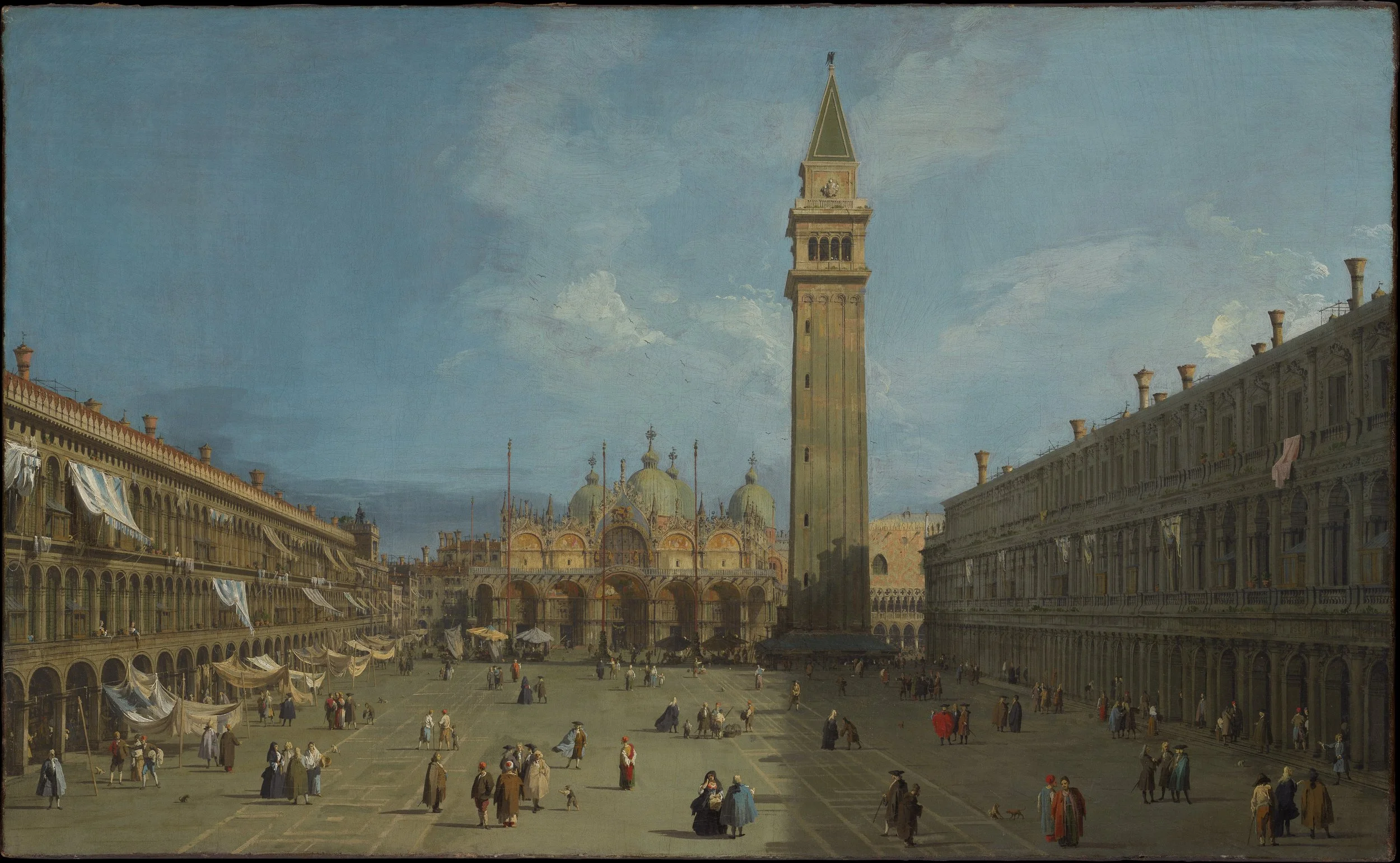
Canaletto, Piazza San Marco, 1720s. Courtesy of the Metropolitan Museum of Art.
Entering the gallery titled “Venetian Views” at The Metropolitan Museum of Art, I found myself in a markedly different setting from the surrounding rooms of European Paintings, where religious and mythological subjects predominate. Here, the city itself had become the subject of painting. Rather than unfolding through sacred history or classical mythology, the visual experience centered on Venice: its architecture, its public spaces, and the relationship between the built city and the water surrounding it. As the wall text explains, these works belong to the tradition of the veduta, an Italian term for topographical views that flourished in the eighteenth century and ranged from the documentary to the imaginary. Often purchased and displayed in groups, they functioned as “luxurious snapshots” that transported travelers back to their experiences on the Grand Tour.
Among them, Canaletto’s Piazza San Marco immediately drew me in, though what caught my eye first was not a specific building but the sharp diagonal line of shadow cutting across the square. Beyond that diagonal, light and shade organize the piazza: sunlight illuminates the long arcade, the white awnings above it, and the church domes, while the bell tower and the square’s right side remain in shadow. Looking closer, I noticed how the geometric pattern of the paving gives the space a clear visual order.
Yet Canaletto did not simply record Venice as it appeared; he transformed observation into an image shaped by geometry, optical instruments, artistic judgment, and the expectations of his time. First, he relied on Renaissance linear perspective, whose early development is associated with Filippo Brunelleschi and whose principles were later codified by Leon Battista Alberti, to structure the square’s depth. As the Met notes, he employed precise perspectival drawings and used a straightedge to establish the geometries of his compositions. Second, he turned to the camera obscura, an optical instrument that projects an exterior scene onto an interior surface. The Museo Correr in Venice preserves an eighteenth-century camera obscura inscribed “A. CANAL,” traditionally associated with Canaletto. While we cannot be certain he used this exact device, its survival offers a tangible connection to the optical methods available to him.
The third element was artistic judgment. The Met points out that Canaletto reduced the number of windows in the bell tower and made the three flagstaffs before the church taller than they were in reality. Painting for an audience that valued recognizable views of Venice, he nevertheless adjusted what he observed to produce images that were also visually harmonious. His instruments helped him observe, but it was his own eye that determined what to emphasize, alter, and compose.
Reflecting on Canaletto’s camera obscura made me think of my iPhone camera. Separated by centuries, both instruments mediate how we see and record the visible world rather than simply capturing it passively. As a note in the final chapter of our textbook reminds us: Plus ça change, plus c'est la même chose—the more things change, the more they remain the same.¹
Notes
¹ Laurie Schneider Adams, A History of Western Art, rev. 4th ed. (New York: McGraw-Hill, 2008), 566.
Further reading
I hope to explore Canaletto’s work and studio methods further through the following sources:
Philip Steadman, Canaletto’s Camera (London: UCL Press, 2025). A detailed and recent investigation into Canaletto’s working methods, examining his use of the camera obscura, architectural drawings, and the ways he adapted and recombined observed material in his finished compositions. Available as an open-access publication through UCL Press.
Katharine Baetjer and J. G. Links, Canaletto (1989). The Metropolitan Museum of Art exhibition catalogue, examining Canaletto’s career, Venetian patronage, and artistic practice. Available online through MetPublications.
Samuel Y. Edgerton, Jr., The Renaissance Rediscovery of Linear Perspective (New York: Basic Books, 1975). A foundational study of the Renaissance development of linear perspective, including the contributions of Filippo Brunelleschi and Leon Battista Alberti.
Additional reference work
W. G. Constable, revised by J. G. Links, Canaletto: Giovanni Antonio Canal, 1697–1768, 2nd ed., 2 vols. (Oxford: Clarendon Press, 1989). The standard catalogue raisonné of Canaletto's paintings and drawings. This is particularly useful as an authoritative reference for individual works and their documentation.
Stone, Song, and Flesh in Watteau
By Shira Mayesh
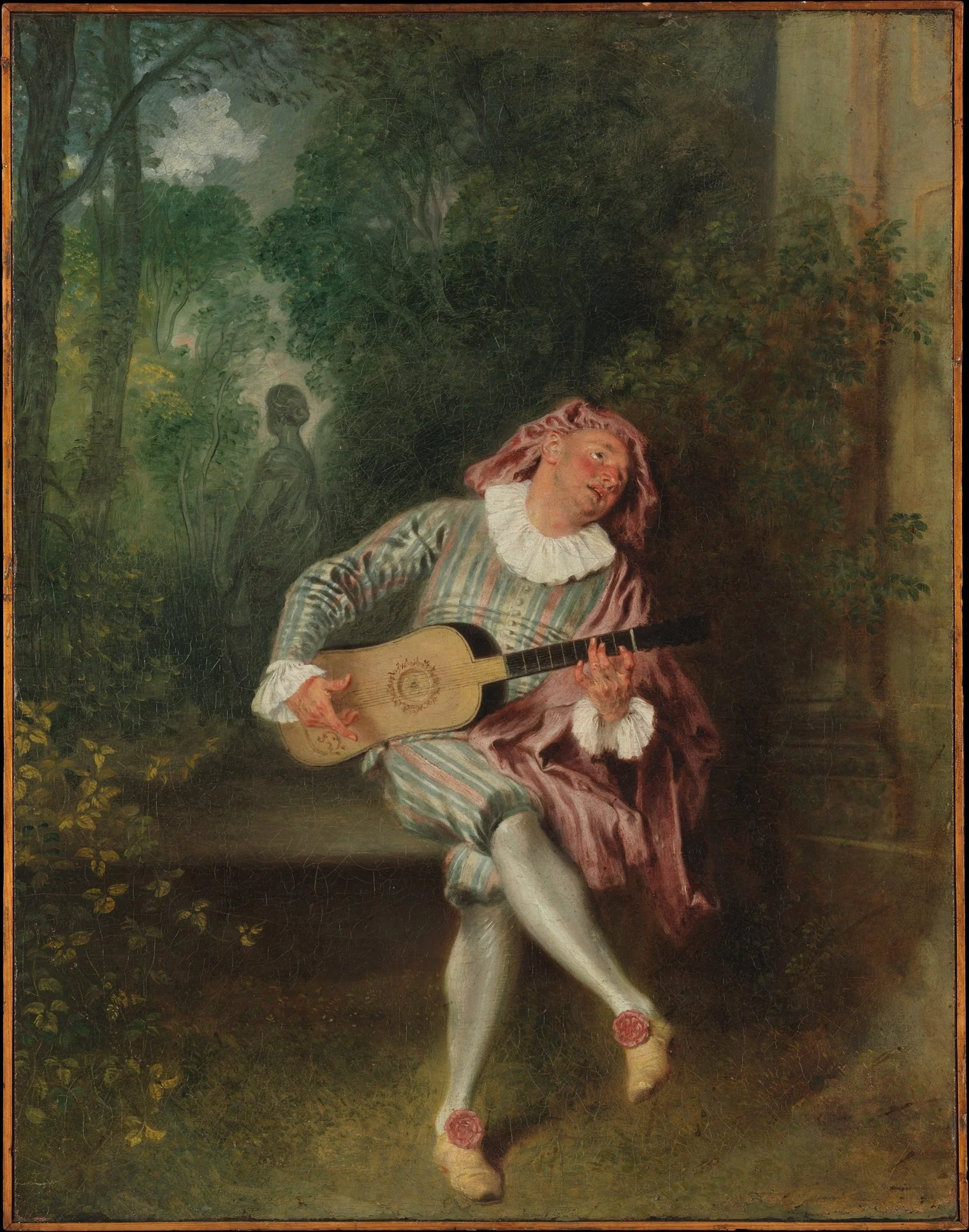
Antoine Watteau, Mezzetin, ca. 1718–20. Courtesy of the Metropolitan Museum of Art.
When I first stood before Antoine Watteau's Mezzetin, I saw a singer lost in his own song. Seated on a stone bench in a garden, he throws his head back and lifts his eyes upward, his mouth open and his cheeks flushed. He wears the costume of Mezzetin, a stock character of the commedia dell'arte: striped silk, a ruff, a floppy pink cap, and a short cape.¹ The stripes are a linear design, yet they are brushed loosely, bending with the folds and breaking into flickers of light. Laurie Schneider Adams places Watteau in "the painterly, colorist tradition of his compatriot Rubens," and the loose, glinting stripes show that inheritance.² The guitar, by contrast, is the crispest thing in the picture, with a clean outline, a precise rosette, and straight strings. His fingers, red and splayed across the strings, look almost like the claws of a bird, an exaggeration worthy of a comedian. Yet the Met notes that Watteau's delicate touch is especially visible in the hands, so that the musician's hands are also, in a sense, the painter's own.
The bench extends from a stone pillar at the right, half covered in leaves, as if the architecture were vanishing into the garden, while the rest of the picture belongs to trees, open sky, and clouds. The man himself, with his costume, his guitar, and his song, brings the world of the stage back into this nature. The only flowers in sight are the pink ribbon rosettes on his shoes, artificial roses that bring color to a garden painted almost entirely in greens.
In our textbook, Adams introduces Watteau through Pilgrimage to Cythera, the painting for which the French Academy added the category of fêtes galantes. At the right of that painting, a statue of Venus is draped with flowers, and Adams writes that "her presence in stone marks the enduring character of love as well as of the Classical tradition, in contrast to the frivolity and transience of the trysting lovers."³ In Mezzetin, the garden statue is a woman who turns her back, which the Met reads as a sign that his love is unrequited. The stone still endures, and it is his song that passes. Only the yellow leaves at the lower left turn toward him like small ears, as if the garden were listening while the statue does not.⁴
The painting reverses what I expected of sculpture and painting. The statue, a sculpture of a body, appears only as a distant, grey image half lost among the trees, while the painted man, with his flushed face, his open mouth, and his hands gone wild with music, is the most bodily presence in the picture.⁵
Notes
¹ The Metropolitan Museum of Art, catalogue entry for Antoine Watteau, Mezzetin, ca. 1718–20.
² Laurie Schneider Adams, A History of Western Art, rev. 4th ed. (New York: McGraw-Hill, 2008), 368.
³ Adams, 368.
⁴ The comparison of leaves to ears recalls Nairy Baghramian's oreiller series, whose French title, meaning "pillow," evokes the ear at rest. See Nairy Baghramian, nameless, Marian Goodman Gallery, New York, 2026.
⁵ For further study, I hope to explore Watteau's world of theater and music in Katharine Baetjer, ed., Watteau, Music, and Theater (New York: Metropolitan Museum of Art, 2009), whose entry on Mezzetin (pp. 45–47) suggests that the singer's head was drawn from a studio model rather than from the actor famous in the role, and to read Jean Starobinski, The Invention of Liberty, 1700–1789, trans. Bernard C. Swift (Geneva: Skira, 1964), and Norman Bryson, Word and Image: French Painting of the Ancien Régime (Cambridge: Cambridge University Press, 1981).
Boucher: A Mirror for the Bath
By Maxwell Dopp (to be finalized through Claude)
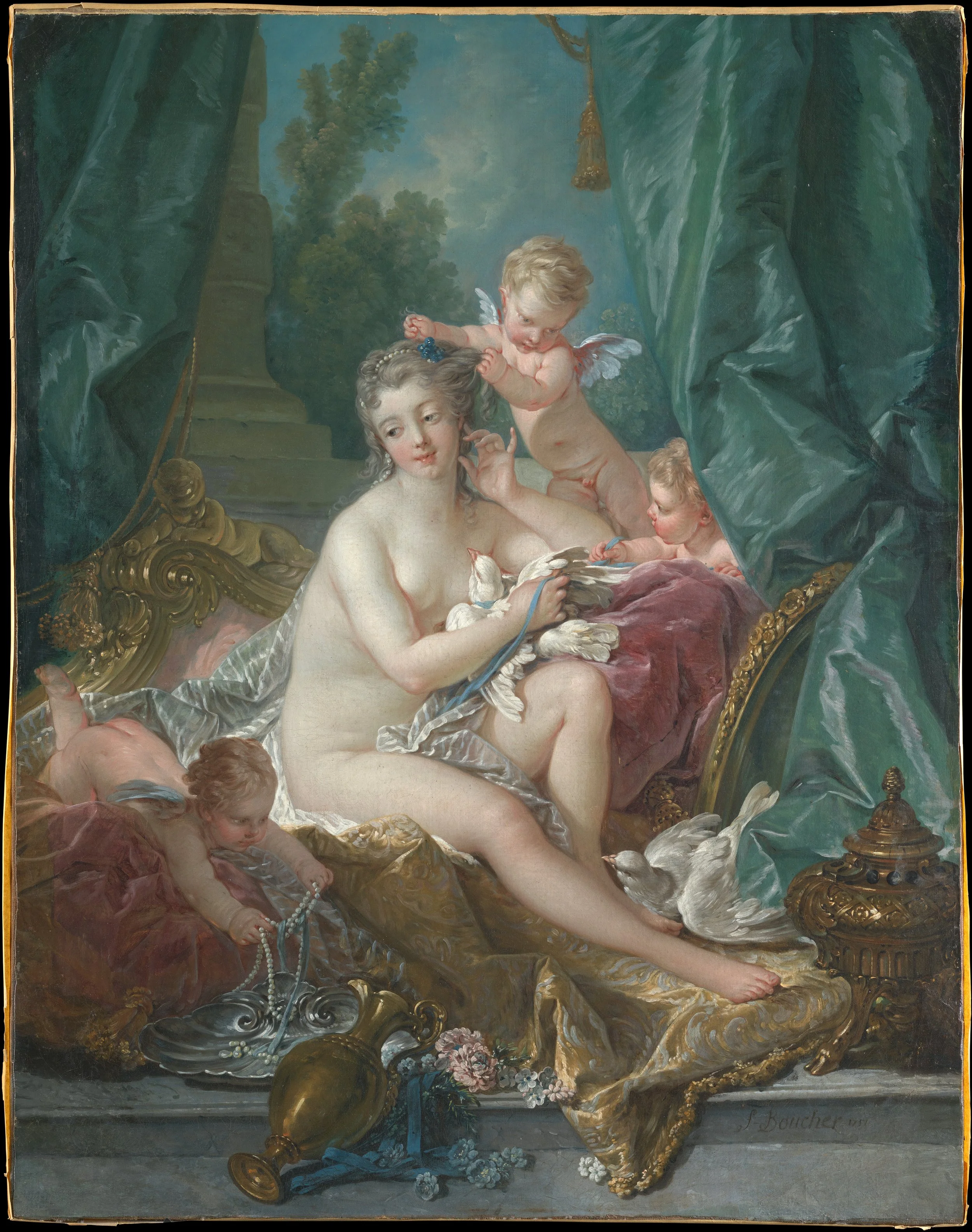
François Boucher, The Toilette of Venus, 1751. Courtesy of the Metropolitan Museum of Art.
In a gallery of The Metropolitan Museum of Art intriguingly titled “Urban Luxuries,” François Boucher’s The Toilette of Venus depicts a pause within a daily ritual rather than dramatizing a narrative. The titular Venus has finished her bath and sits on a Rococo daybed, its gilded end curling into scrolls behind her, while one winged putto arranges her hair and another draws a string of pearls from a silver dish. Her raised hand rests against her hair and her gaze drifts aside, so that the routine seems suspended in a moment of contemplation. Instead of an event, Boucher gives me an accumulation of surfaces: the pale flesh of the goddess, the white feathers of the doves pressed against it, the small hard pearls, the green silk curtains, the velvet and damask beneath her, and the gilded frame of an oval mirror. Her hair is a soft gray, the effect of the powder fashionable in Boucher’s own day, so that the goddess also looks like a lady of the French court.
As I look, my eye finds nowhere to settle. The arrangement of furniture, fabric, and flowers is asymmetrical, and each surface leads to the next, from skin to feathers to pearls to cloth. Boucher models the body through gentle shifts of tone rather than firm outline, so that Venus seems to sink into the fabrics around her. In Heinrich Wölfflin’s terms, the picture is painterly rather than linear, since its parts flow into one another and the whole matters more than any single contour.¹ Boucher had learned this lightness early, etching dozens of Antoine Watteau’s drawings as a young man, and the soft, broken touch of Watteau’s Mezzetin in Gallery 629 reappears here in the feathers and folds of cloth. I take in the painting much as I would a room full of soft things, with my sense of touch as engaged as my eyes.
The painting’s original setting explains why this matters. Boucher made it for Madame de Pompadour, the mistress of Louis XV, and it was set into the carved and painted wood paneling of her bathing rooms at the Château de Bellevue. Its first viewer, then, was a woman at her own bath, looking at a goddess after hers. The mirror beside Venus, the powder in her hair, and the jewels being placed upon her all belonged to Pompadour’s daily ritual as well.² The painting did not offer its viewer a story so much as mirror her own, placing her routine of bathing and dressing before her eyes.
Seen today on a museum wall, the canvas has lost the room that completed it. Yet the experience it was designed for survives in the way it still asks to be looked at: slowly, surface by surface, with an awareness of one’s own body standing before it. Boucher’s subject is not an event but a sensation, and in Pompadour’s bathing room, looking at Venus was nearly the same as looking at oneself.
Notes
¹ Heinrich Wölfflin, Principles of Art History: The Problem of the Development of Style in Early Modern Art, trans. Jonathan Blower (Los Angeles: Getty Research Institute, 2015).
² Melissa Hyde, Making Up the Rococo: François Boucher and His Critics (Los Angeles: Getty Research Institute, 2006).
Panini: Museum Within Museum
By Jolene Griffin Michelli
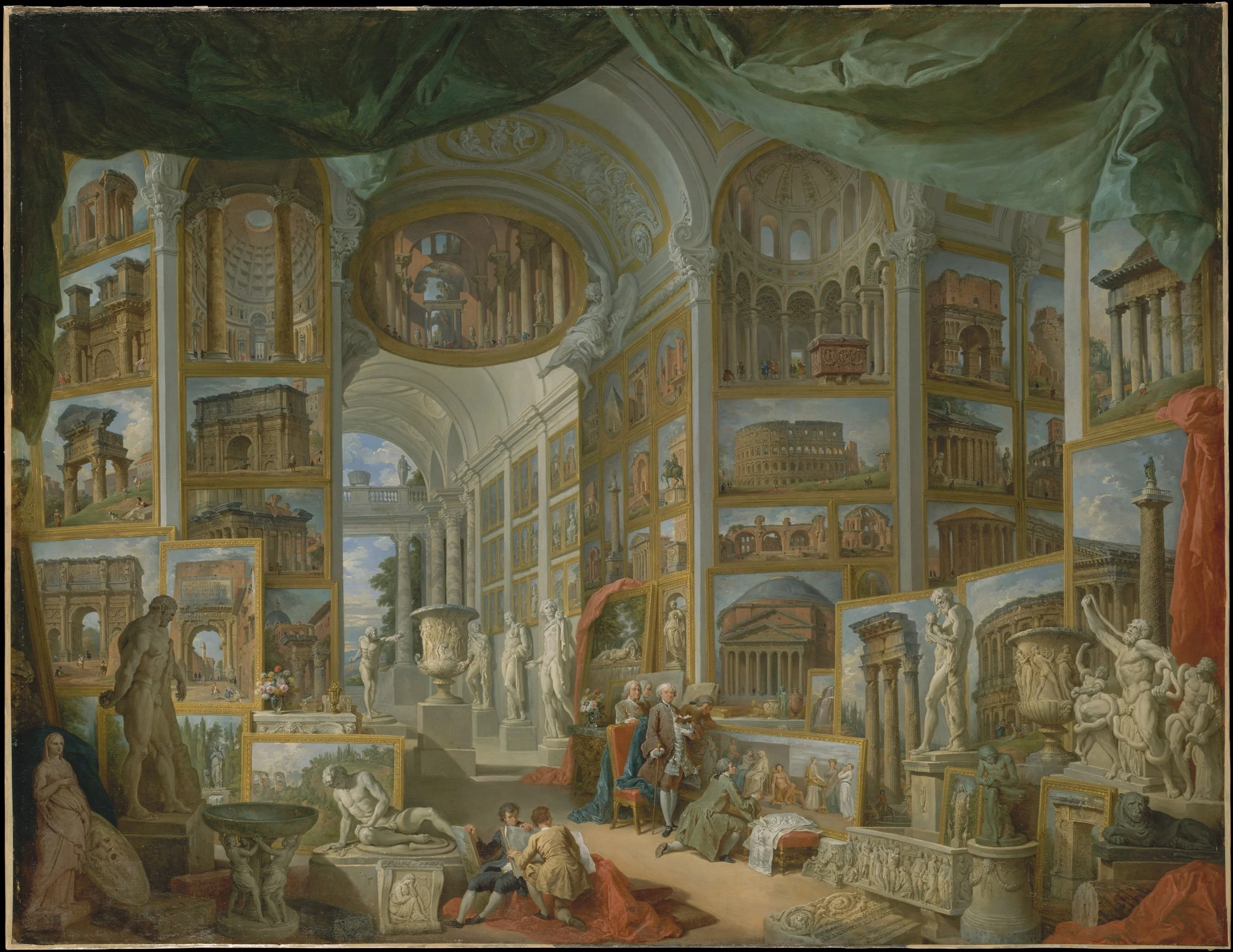
Giovanni Paolo Panini, Ancient Rome, 1757. Courtesy of the Metropolitan Museum of Art.
Giovanni Paolo Panini, Modern Rome, 1757. Courtesy of the Metropolitan Museum of Art.
Flanking a passageway in The Metropolitan Museum of Art’s Grand Tour gallery, Giovanni Paolo Panini’s pendant canvases Ancient Rome and Modern Rome confront the viewer with an immediate puzzle about how a city can be known. Rather than painting actual Roman streets or open vistas, Panini invents two cavernous, imaginary galleries packed floor to ceiling with framed easel paintings and freestanding sculptures of Rome’s famous landmarks. In Ancient Rome, sunlit views of the Colosseum, the Pantheon, and Trajan’s Column crowd the walls beside a marble cast of the Laocoön.
Across the opening, Modern Rome drapes its vaulted hall in crimson velvet to catalog monuments from the preceding two centuries, including St. Peter’s Basilica, Piazza Navona, the Trevi Fountain, Michelangelo’s Moses, and statues by Gian Lorenzo Bernini. Standing in the threshold between them, one does not look at Rome itself, but at two exhaustive inventories of pictures placed in direct conversation with one another. That double mediation turns a pair of souvenir views into a subtle argument about how a city is known. As the Met’s wall labels note, eighteenth-century guidebooks routinely contrasted ancient and modern works to weigh their relative strengths, and Panini translates that literary comparison into two curated rooms for his patron, the French ambassador comte de Stainville.¹
Within each gallery, Panini collapses centuries into a single, simultaneous glance, flattening geographic distance and historical time onto a grid of gilded frames. Yet he never pretends that this encyclopedic order is unmediated. Every monument is visibly tilted, cropped, and contained within a painted border like a luxurious postcard, reminding the viewer that familiarity with the city arrives already filtered through artistic convention and aristocratic taste. Even the recently finished Trevi Fountain is presented as an instant classic, already framed for posterity alongside Renaissance masterpieces. Panini underscores this layered mediation through the figures seated in armchairs at the center of both scenes. In Ancient Rome, the comte de Stainville holds an open guidebook, reading about the very monuments surrounding him on canvas while Panini stands quietly behind his chair; in Modern Rome, the ambassador sits enthroned amid the newer masterpieces as if presiding over a living archive. Long before Heinrich Wölfflin popularized dual slide projections in the 1890s to teach visual style through side-by-side comparison, Panini built that comparative habit directly into the architecture of a room. Together, the pair argues that a place becomes culturally legible only once it has been broken into fragments, framed, and arranged inside the mind and gallery of the collector.
Note
¹ The Metropolitan Museum of Art, Grand Tour gallery panel and object labels for Giovanni Paolo Panini, Ancient Rome and Modern Rome, 1757.
Senses of Touch in Fragonard
By Sixuan Liu
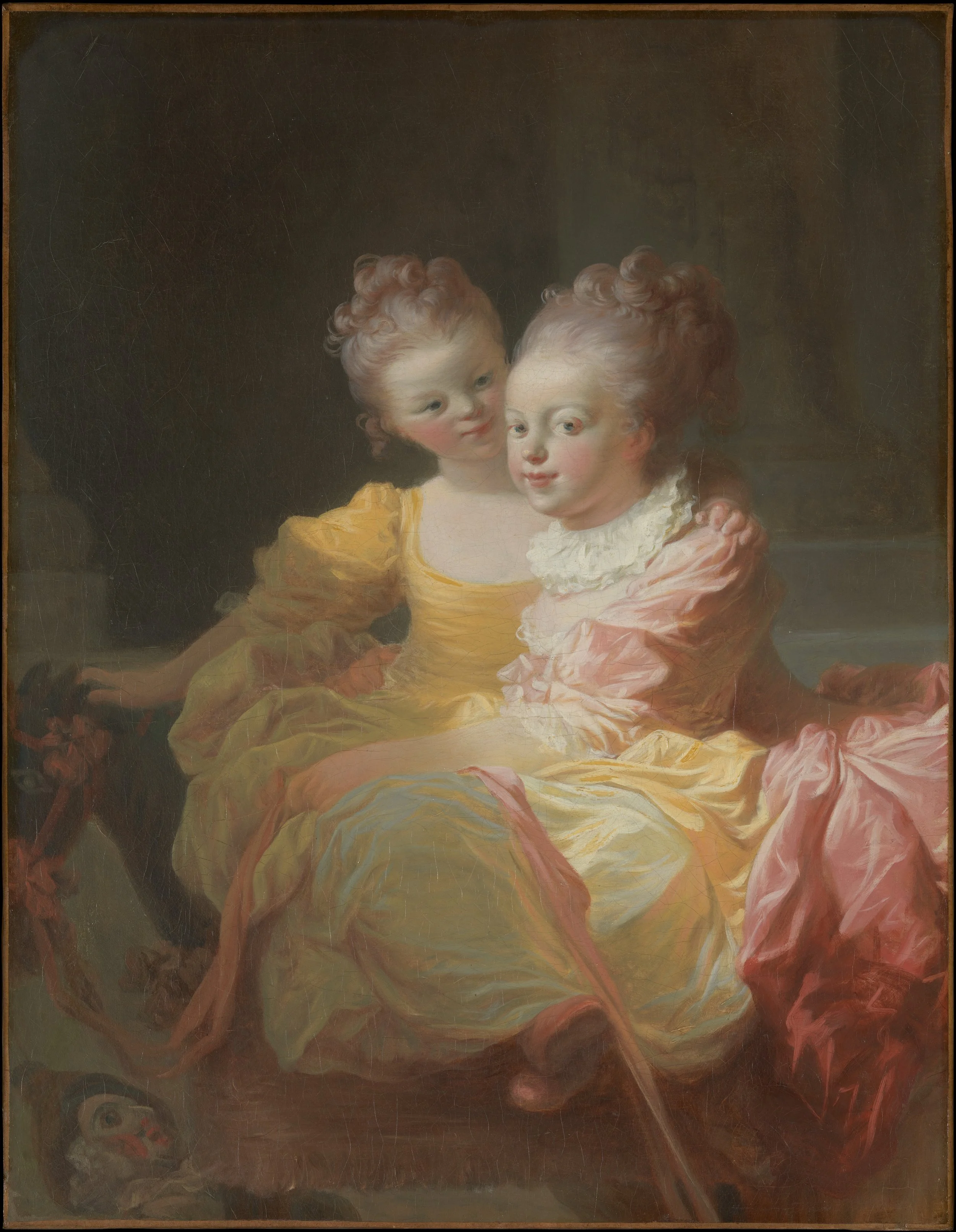
Jean-Honoré Fragonard, The Two Sisters, ca. 1769–70. Courtesy of the Metropolitan Museum of Art.
What first drew me to Jean-Honoré Fragonard’s The Two Sisters was its color as much as the sense of affection it conveyed. Two little girls with rosy cheeks sit close together in billowing dresses of yellow and pink silk, with touches of pale blue in the folds. The girl in yellow puts her arm around her sister and turns to look at her, while the girl in pink smiles out at the viewer. Up close, the silk is painted in quick, broad strokes, and where the two dresses meet, the yellow and pink run into each other, so that it is hard to tell where one sister’s skirt ends and the other’s begins. For all the speed of Fragonard’s brush, from a few steps back the strokes come together into the sheen of real silk, while the faces, painted more smoothly, seem almost alive. The white ruff of the girl in pink is painted in a few thick strokes that become lace only at a distance. Heinrich Wölfflin describes this way of seeing through the same detail. Looking at a real person, he notes, the lace collar below a face requires “closer inspection or at least a particular adjustment of the eye,” and linear painting nonetheless shows it clearly, while painterly handling can render it as “scarcely more than a white haze,” giving “only as much as the gaze was capable of perceiving when taking in the whole.”¹ That haze must still “convince the viewer that the detail is all there,” and Fragonard’s does. Behind the girls, architectural forms are barely visible in the brown darkness, as if out of focus, so that only the faces reach what Wölfflin calls absolute clarity and the rest of the room remains relative. Whether Fragonard was examining vision itself, the clarity of the point the eye focuses on against the blur of what lies at a distance or at the edges of sight, is impossible to know. Still, his softened version of tenebrism, a dark ground without Caravaggio’s harsh contrasts, makes me aware of my own act of seeing: my eye rests on the faces, and the room around them fades. The grace I felt in the picture comes from this handling as much as from the girls themselves.
Not every face in the painting is alive. At the lower left, the mask of Polichinelle, the clown of the commedia dell’arte, stares upward with a fixed, unfocused gaze, unlike the sisters, one looking at her sister, the other at us. At the far left, beneath the hand of the girl in yellow, is what the Met identifies as a toy horse, recognizable mainly by its red bridle, its face cut off by the edge of the canvas. I learned that the painting was once about twice as large. A pastel copy made in 1770 by Fragonard’s friend Jean-Claude Richard, the Abbé de Saint-Non, still shows the missing half, where one sister rides the wheeled horse, and an early description adds that her sister was pushing her along.² Without that half, the game is gone, and what remains is two sisters sitting close together. Fragonard did not make this cut, so the affection that first moved me is partly the work of history.
The painting also reminded me of another picture of sisters, one we studied in our textbook: John Singer Sargent’s The Daughters of Edward Darley Boit, painted more than a century later. Laurie Schneider Adams observes that Sargent “did not allow form to dissolve into light,” and that “the spaces separating the figures convey a sense of tension.”³ Fragonard does the opposite. His sisters share one space, held together by an arm around a shoulder, and the same painterly touch that dissolves the edges of their silk joins them to each other, to the painter’s hand, and to us as we look, as if to our own interiority.⁴
Notes
¹ Heinrich Wölfflin, Principles of Art History: The Problem of the Development of Style in Early Modern Art, trans. Jonathan Blower (Los Angeles: Getty Research Institute, 2015), 104. Wölfflin’s example of the painterly collar is Frans Hals.
² The Metropolitan Museum of Art, catalogue entries for Jean-Honoré Fragonard, The Two Sisters, ca. 1769–70, and Jean-Claude Richard, Abbé de Saint-Non, The Two Sisters, 1770, pastel on paper.
³ Laurie Schneider Adams, A History of Western Art, rev. 4th ed. (New York: McGraw-Hill, 2008), 446–47.
⁴ For further study, I hope to explore Ewa Lajer-Burcharth’s discussion of children’s play and of Turgot’s “inner touch” (le tact intérieur) in The Painter’s Touch: Boucher, Chardin, Fragonard (Princeton: Princeton University Press, 2018), 142–43.
Fidelity in Prud'hon
By Aralynn Mitchell

Pierre Paul Prud'hon, completed by Charles Pompée Le Boulanger de Boisfrémont, Andromache and Astyanax, 1813–17 and 1823–24. Courtesy of the Metropolitan Museum of Art.
Though our Met project is grounded in formal analysis, the intriguing elements of Pierre Paul Prud’hon’s Andromache and Astyanax led me to explore its complex narrative through iconography, the study of subject matter in art. For the story, however, I had to set aside, in part, Heinrich Wölfflin’s principles, which treat form apart from subject, and turn to Jean Racine’s tragedy Andromaque, from which Prud’hon drew his subject. The art historian Laurence B. Kanter’s article on the painting was especially helpful in guiding my understanding of its narrative.¹
Seen first as form alone, the painting keeps one of Leon Battista Alberti's lessons in On Painting (1435) and sets aside another. It has no vanishing point and no measured floor. The figures stand on a shallow stage before a dark wall, as in an ancient relief, rather than within the perspective window Alberti described. Yet the painting follows his idea of the istoria, a story told through a moderate number of figures whose gestures express their feelings. In Wölfflin's terms, this frieze of distinct figures, each turned toward the center, is a classic multiplicity of independent parts. The smoky modeling, however, binds them together. Contours soften into shadow, and the forms seem to emerge from the darkness rather than being drawn against it, so that the composition moves toward the unity Wölfflin associates with the Baroque. The brightest values gather in the white and gold at the center, set against the deep red at the right and the near-black wall behind, and the central pair forms a compact triangle, the most stable shape on the canvas. Neoclassical in its subject and its frieze, the painting is Baroque in its light.
To understand the scene, I turned to Racine's tragedy, first performed in 1667. Racine drew his story from ancient authors such as Euripides and Virgil, who wrote about the legendary Trojan War, set by Greek tradition around the twelfth century BCE. After the Greeks destroy Troy, they demand the death of Astyanax, and Pyrrhus, who loves Andromache, offers to protect the child if she will accept him. Prud'hon's painting, begun nearly a century and a half after the play, draws on its second act.
The figures of the story
Trojans
– Andromache, widow of Hector and captive of Pyrrhus (center, in white and gold)
– Astyanax, her young son, the last heir of Troy (center, in her arms)
– Hector, Andromache's husband (absent)
Greeks
– Pyrrhus, a king, son of Achilles (right, in red)
– Phoenix, Pyrrhus' old tutor (behind Pyrrhus)
– Achilles, Pyrrhus' father, the warrior who killed Hector (absent)
Attendants
– Cephise, Andromache's confidante (left)
– The nurse of Astyanax (right, kneeling)
Andromache sits at the center, her head bent toward her son and her eyes fixed on his. She does not look at Pyrrhus. Her attention belongs entirely to the child, and she seems unaware of the man reaching toward her. Her white and gold drapery receives the fullest light in the painting, and her face and arms are modeled in soft gradations that emerge from the surrounding darkness without hard contours.
Astyanax has just rushed from the arms of his nurse into his mother's embrace. His hands rest on her breast, and his face is lifted toward hers, so that mother and son form a closed circle within the composition. In Racine's play, Andromache sees in the boy the features of her dead husband.
Pyrrhus stands at the right in a red cloak, his arm extended toward Andromache. His open hand stops in the dark space just above her head and never reaches her. Behind him, his old tutor Phoenix watches from the shadow. The gap between Pyrrhus' hand and Andromache's head holds the drama of the scene: an appeal that goes unanswered.
The other figures frame the central pair. At the left, behind Andromache's chair, her confidante Cephise clasps her hands, and at the right the kneeling nurse raises both hands toward the child she has just released. The figures are arranged across a shallow stage, parallel to the picture plane, and their hands lead the eye inward from both sides to the embrace at the center.
An iconological reading looks beyond the story to what the embrace means. Kanter explains:
As envisioned by Prud'hon, Andromache and Astyanax illustrates no single scene from Racine's Andromaque as it might have been performed on stage, but expands upon the dialogue between Pyrrhus and Phoenix in act II, scene v. Pyrrhus, resolved to overcome his love for Andromache and to deliver Astyanax to the Greeks, expresses the cause of his anger and change of heart to him by describing to him the scene of Andromache's ingratitude, shown in the foreground of the painting, in which she responded to his every assurance of protection for Astyanax only by asserting her grief for her dead husband, and recalling his very appearance in that of her son.²
In Racine's verses, Andromache cries, "It is Hector… it is he himself, it is you, dear husband, whom I embrace."³ The embrace at the center of Prud'hon's canvas therefore holds three people: a mother, her son, and the dead hero present in the child's face. Pyrrhus' hand remains outside this circle, reaching toward a woman whose fidelity belongs to the dead.⁴ Though at first this mythological story seemed distant from me in time, its themes of war, loss, and fidelity still fill the stages of theaters and opera houses today, from Lincoln Center to the Comédie-Française in Paris.
Notes
¹ Prud'hon left the painting unfinished at his death in 1823, and his student Charles Boulanger de Boisfremont completed it for the Salon of 1824. On the identification of the figures and the extent of Boisfremont's changes, especially to Pyrrhus and Phoenix, see Laurence B. Kanter, "Andromache and Astyanax by Pierre-Paul Prud'hon and Charles Boulanger de Boisfremont," Metropolitan Museum Journal 19/20 (1986): 143–50.
² Kanter, 149.
³ Jean Racine, Andromaque (1667), act II, scene v: "C'est Hector, disait-elle en l'embrassant toujours; / Voilà ses yeux, sa bouche, et déjà son audace; / C'est lui-même, c'est toi, cher époux, que j'embrasse." (“It is Hector, she kept saying as she embraced him; / There are his eyes, his mouth, and already his boldness; / It is he himself, it is you, dear husband, whom I embrace.”)
⁴ Kanter suggests that Prud'hon's first idea for the painting may have alluded to Empress Marie-Louise and her son, the young King of Rome, after Napoleon's abdication in 1814, and he quotes Napoleon: "the fate of Astyanax, prisoner of the Greeks, always seemed to me the saddest in history." Kanter, 145.
The Universe and the Unknown
By Rex Killian

Caspar David Friedrich, Two Men Contemplating the Moon, ca. 1825–30. Courtesy of the Metropolitan Museum of Art.
In Caspar David Friedrich's Two Men Contemplating the Moon, two figures stand on a rocky path at dusk, seen from behind, while a crescent moon glows low in a violet sky. The Met identifies them as Friedrich himself and his student August Heinrich (1794–1822). The younger man rests his hand on the shoulder of the older, who leans on a walking stick, and the gesture unites teacher and student in a shared act of looking. Twenty years apart in age, the two suggest a relationship that is almost paternal. The painting stages a human confrontation with nature that is awe-inspiring to the point of terror, a quality that Renaissance writers, speaking of Michelangelo, called terribilità.
The composition frames this confrontation. On the left, the dark trunk of a pine rises to the top edge of the picture. On the right, an oak climbs in a long diagonal from the lower edge toward the upper left, its roots gripping the rocks and its limbs spreading over the sky. Between the two trees, the branches form an opening, a window made not of architecture but of nature, through which the moon appears at the center. Below it, a broken branch draped with moss hangs across the horizon like the lower edge of a frame.
Light gathers in the middle of the painting and fades toward its edges. The ground, the rocks, and the trunks sink into brown and olive shadow, while the sky around the moon warms into a pale rose glow. The small size of the canvas draws the viewer close. In the version of 1819 reproduced in Laurie Schneider Adams' A History of Western Art, now in Dresden, the same composition burns in red and orange.¹ The Met's later canvas, painted after Heinrich's death, turns to violet and gray-green, with warmth only in the glow around the moon.
In its facture, the painting is as linear as it is painterly. The branches stand against the sky as sharp, dark contours, the crescent is a precise curve, and the two men are clean silhouettes. Yet the sky behind them is blended in smooth gradations, with almost no visible brushstroke, and the distant pines at the right dissolve into the haze. The painting is usually placed within Romanticism for its mood and subject, and for a composition that turns the viewer toward nature, rather than for its facture. Writing of Romantic music, Adams observes that "the expression of mood and feeling takes precedence over form and structure."² In Friedrich's canvas, the melancholy of the scene arises from its exact contours and measured gradations of light.
Adams places the painting within "the Romantic aesthetic of the sublime." In a box beside her text, she summarizes the ideas of Edmund Burke, whose A Philosophical Enquiry into the Origin of Our Ideas of the Sublime and the Beautiful (1757) argued that the passions and the irrational "exert a powerful, awesome force on people." Burke's system holds together opposite forces, an attraction to fear, pain, and death on one side and to beauty, pleasure, and love on the other. In Friedrich's painting, fear lies in the dark masses at the edges, loss in the broken branch and the cut stump at the lower left, and beauty in the rose glow around the moon. According to Adams, the figures embody the sublime "in being engulfed by nature's darkness, in the mysterious quality of the light, and in their ancient mode of dress."³
The meaning of the sublime, however, has not remained the same across places and times. Burke wrote in eighteenth-century Britain about the passions in general. In Friedrich's Germany, the moon was, in the words of the Met's label, "an object of pious contemplation," and the men's old German dress, as Adams writes, reflects "Romantic nostalgia for the past."⁴ The painting shows neither storm nor abyss. Its lines turn toward a quiet light at the center. Here the sublime holds terror and devotion together, shaped by the religious and national feelings of Friedrich's generation. More than a century later, the art historian Robert Rosenblum traced a line from Friedrich to Mark Rothko, and the sublime came to describe paintings of a high degree of abstraction in postwar America. In Rothko's fields of color, the spiritual longing that Friedrich had placed in a moonlit landscape seemed to appear without any landscape at all.⁵ Since astronauts walked on the moon in 1969, its mystery has changed, and a viewer today stands before Friedrich's crescent knowing what the two men could not know. Yet the small star that shines beside the moon reminds me that our awe before the immensity of the stars and the cosmic horizon has hardly changed. The meaning of the sublime shifts with its historical and cultural context.
Notes
¹ Laurie Schneider Adams, A History of Western Art, rev. 4th ed. (New York: McGraw-Hill, 2008), 405.
² Adams, 395.
³ Adams, 405.
⁴ The Metropolitan Museum of Art, label for Caspar David Friedrich, Two Men Contemplating the Moon, ca. 1825–30. Adams, 405.
⁵ Robert Rosenblum, Modern Painting and the Northern Romantic Tradition: Friedrich to Rothko (New York: Harper & Row, 1975). For further study, see Alison Hokanson and Joanna Sheers Seidenstein, eds., Caspar David Friedrich: The Soul of Nature (New York: The Metropolitan Museum of Art, 2025).
Ingres’ Own Mannerism
By Chun Hei Wong
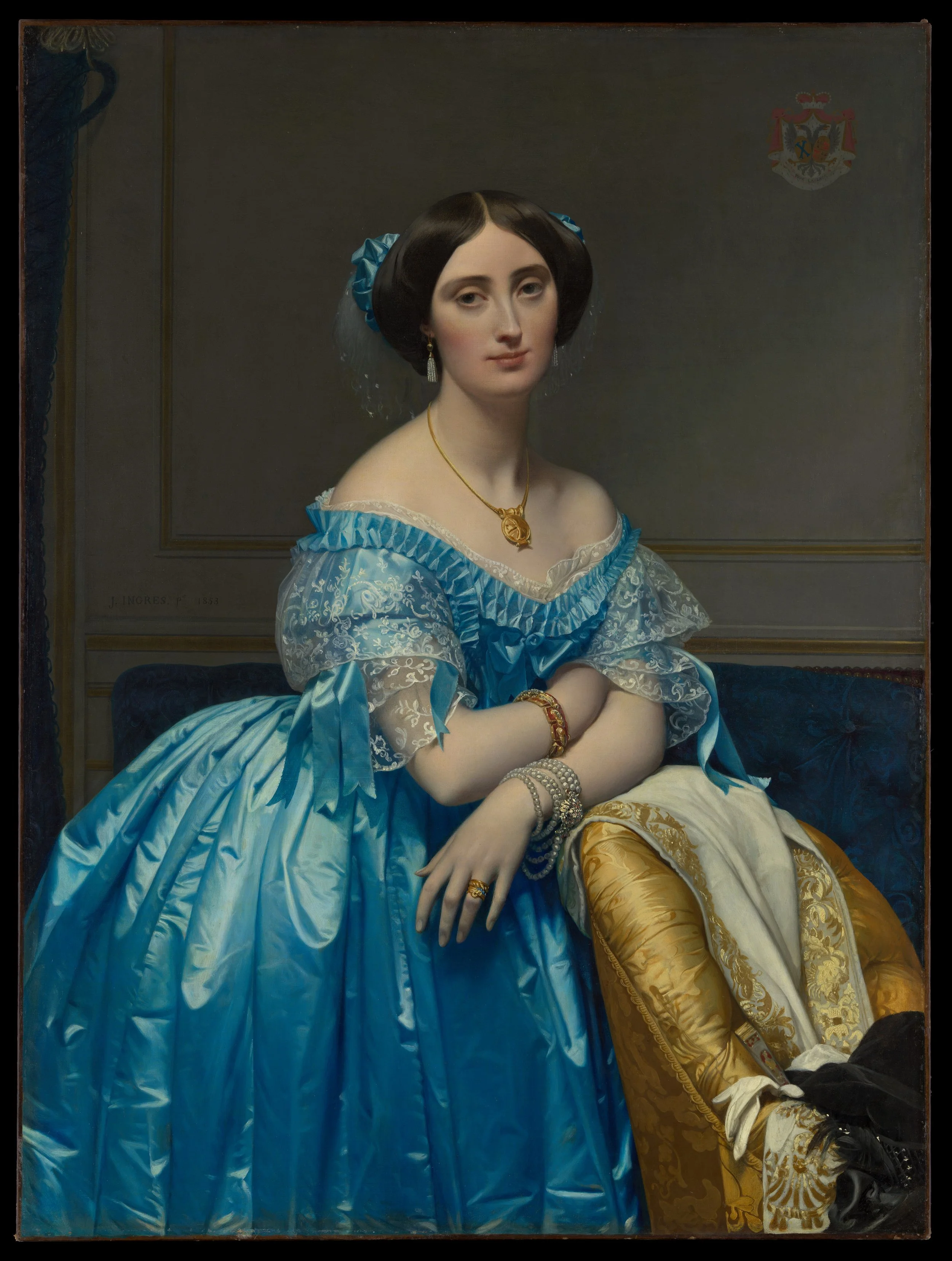
Jean-Auguste-Dominique Ingres, Princesse de Broglie, 1851–53. Courtesy of the Metropolitan Museum of Art.
I had chosen Jean-Auguste-Dominique Ingres' portrait of the Princesse de Broglie before our visit to the Met for its elegance and grace, its restrained palette, and the striking blue of the gown. Yet standing before it, what held me was the care with which every surface is made. She leans forward, her arms folded across the back of a gold damask chair draped with a white shawl embroidered in gold, and looks out at us with a calm, slightly reserved expression. Her blue satin gown catches the light in sharp, bright folds, the lace of her sleeves is traced thread by thread, and pearls wind around her wrist in several strands. Laurie Schneider Adams observes that in Ingres' work "the brushstrokes are submerged to enhance the illusion of texture," and here I could find no trace of the brush at all.¹ Satin, lace, gold, and pearl each keep their own texture, yet all share the same smooth, finished surface.
The space behind her is shallow. A grey wall with gilded moldings runs parallel to the picture plane, and a blue velvet settee closes the room just behind the chair, so that the princess seems brought forward toward us while the background stays still and subdued. Unlike Titian's Venus of Urbino, whose room opens deep behind the reclining figure, this wall stops the eye almost at once. It even behaves like a page: Ingres' signature and the family coat of arms sit on it like inscriptions. In Heinrich Wölfflin's terms, the figure itself belongs to the Renaissance side of his categories: her contours are linear, each part of her body and dress is distinct, and she is shown with absolute clarity. The ground complicates this, since the dim wall and dark settee are softer, the space recedes a little from the angled chair, the frame cuts off the chair, the settee, and the curtain, and the background settles into a single, less defined tone, closer to the Baroque side of the same pairs. Adams recalls Ingres' motto, "Drawing is the probity of art," and every edge here, from the shoulders to the fingertips, is clear.²
Yet within these precise contours, the body itself is softened. Her sloping shoulders, long neck, and smooth arms seem almost boneless, and the fingers of her right hand hang long and pale over the chair. Adams notes that Ingres' work "retains traces of Mannerist elegance," and I was reminded of Parmigianino's Madonna of the Long Neck, which we studied in class.³ Ingres' line does not record anatomy so much as refine it toward an ideal. Adams also writes that Ingres, more than the purely Neoclassical David, "was attracted to the Romantic elements of sensuality and color," and the cool glow of the skin against the blue satin shows that attraction held within the discipline of line.⁴
Looking at a portrait painted in the 1850s through the sequence of styles we followed in class, from the Renaissance through Mannerism and the Baroque, is an exercise in the history of forms. Two centuries after the painterly handling of Rubens and Watteau, the line returns in Ingres, though not unchanged: it encloses a body the painter has quietly reshaped, and surfaces that hide every trace of the hand that made them.⁵
Notes
¹ Laurie Schneider Adams, A History of Western Art, rev. 4th ed. (New York: McGraw-Hill, 2008), 387.
² Adams, 388.
³ Adams, 387.
⁴ Adams, 388.
⁵ For further study, I hope to explore Carol Ockman, Ingres's Eroticized Bodies: Retracing the Serpentine Line (New Haven: Yale University Press, 1995); Susan L. Siegfried, Ingres: Painting Reimagined (New Haven: Yale University Press, 2009); and Gary Tinterow and Philip Conisbee, eds., Portraits by Ingres: Image of an Epoch (New York: Metropolitan Museum of Art, 1999).
Pasini: European Aesthetics, Ottoman Architecture
By Yunxin Li
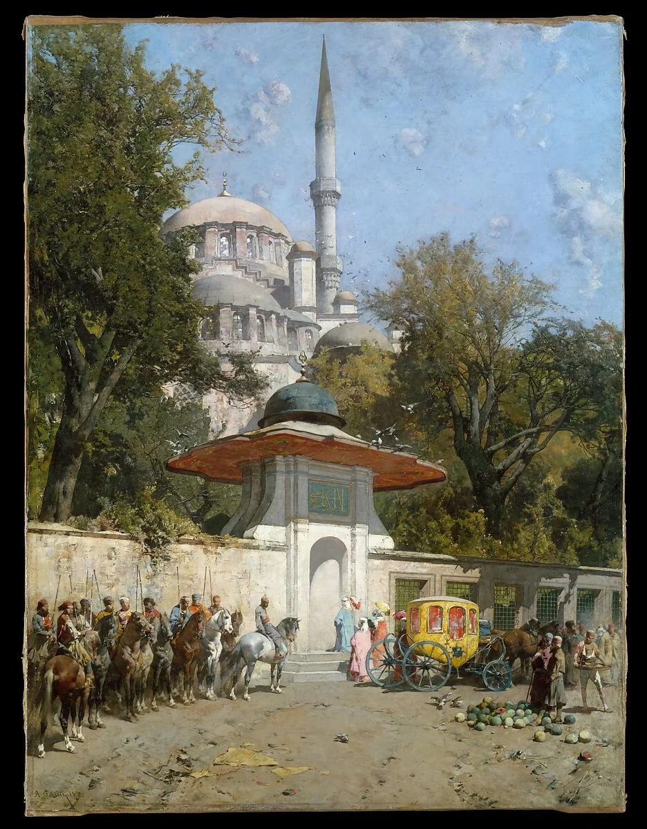
Alberto Pasini, A Mosque, 1872. Courtesy of the Metropolitan Museum of Art.
Visiting The Metropolitan Museum of Art’s exhibition Orientalism: Between Fact and Fantasy, I initially stopped before Jean-Léon Gérôme’s Prayer in the Mosque to study its deep architectural perspective. In person, its heavy theatricality felt strangely oppressive, especially the nearly naked, gaunt dervish standing stiffly in the foreground like a staged punishment.¹ Alberto Pasini’s A Mosque, hanging adjacent to it, offered immediate relief. Instead of a hushed, dim interior, Pasini opens onto a bleached Istanbul street corner in full daylight. Along the lower edge of the canvas, green watermelons sit piled beside a carved marble fountain while mounted guards and a yellow carriage wait on the cobblestones. To the right, four veiled women slip out of the glare into the shadow of an arched stone portal. Above them, dense foliage gives way to the pale dome and needle-thin minaret of the Yeni Valide Mosque.
The canvas holds two distinct visual traditions in quiet tension. Trained in Parma and Paris before traveling through the Middle East in 1855, Pasini builds his street corner out of the measured geometry of Italian linear perspective. Receding walls, sharp diagonal shadows, and calibrated scale lock the scene into the rational window of Renaissance space, casting the viewer as a detached eyewitness looking down an open avenue. Yet the Ottoman architecture he frames resists that clean symmetry. The mass of the mosque rises off-center behind trees, while the ornate Islamic stonework dissolves into quick, crisp dabs of light-struck pigment rather than hard architectural drafting.
That documentary calm is, however, an invention. According to the Met’s label, Pasini did not paint a single site. He grafted an entrance gateway from a separate, later monument onto the early eighteenth-century Yeni Valide Mosque, stitching two distinct Istanbul structures into one continuous view.² Even the casual street vignettes of the watermelons and the waiting carriage work to normalize this splice and disguise an architectural composite as unmediated reportage. Placed within the exhibition’s inquiry into nineteenth-century views of the East, A Mosque reveals a quieter mechanism than Gérôme’s overt drama. It relies on the authority of Italian spatial order to pass off an edited, picturesque fiction as unmediated fact.
Notes
¹ Jean-Léon Gérôme, Prayer in the Mosque, 1871, The Metropolitan Museum of Art, New York.
² The Metropolitan Museum of Art, label for Alberto Pasini, A Mosque, 1872.